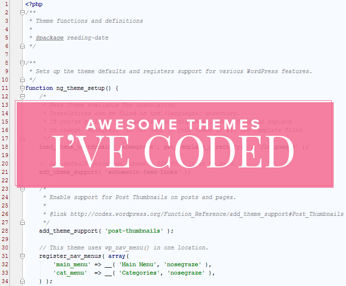
I’ve always shared my design work, but I always felt hesitant about sharing my coding work. I think I was always afraid that if I shared it, people would assume I also designed those sites. Because let’s be honest, even if I make it clear that I coded the sites, there are plenty of skimmers out there (or people who only look at the pretty pictures).
But you know what? I want to share my work. So here we are.
Below are three WordPress blogs that I’ve coded in the last few weeks. The fabulous Anna Moore worked with the clients to create the designs, then she handed the Photoshop files off to me. From there, I turned them into beautiful WordPress themes.
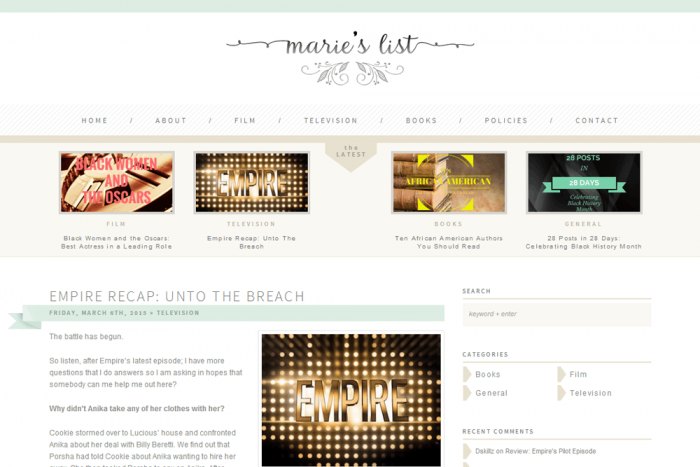
Marie’s List
Cool, custom features
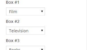
The Latest: Anna designed this awesome section just below the navigation for “The Latest”. This box showcases the most recent post in four different categories. So not only did I code this custom section for the homepage, but I also wanted Natalya to be able to edit it and choose her own categories. So I added a custom section to the WordPress Customizer that allows her to select the category she wants to use for each of the four sections.
Then, once she selects her categories, the category name and most recent post (image, title, and link) automatically gets displayed in each section.
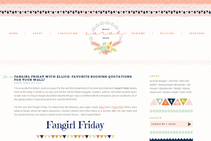
What Sarah Read
Cool, custom features
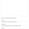
Custom About Widget: I created a custom “About” widget for Sarah. This allows her to not only add her bio (let’s be honest, that could easily be done in a text widget), but also update her social media profile URLs. This user-friendly interface is much better than asking Sarah to edit HTML links manually inserted in a text widget.
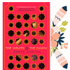
Custom Styled UBB Currently Reading Widget: Anna Moore designed this gorgeous style for the currently reading widget. It was my job to actually code this to work with the widget in the Ultimate Book Blogger Plugin. Sarah gets to use the widget the normal way, with no extra effort on her part, but then it gets this super fabulous styling!
The Reading Date
Cool, custom features
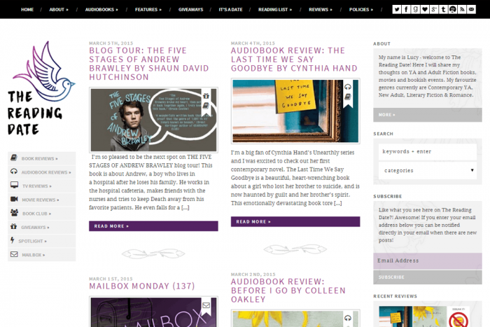
Two Navigation Menus: This design features two customizable menus: one for the top of the page and a second one below the logo, on the left-hand side.
Custom Menu Fields for Font Icons: See on the left-hand menu how each item has an icon associated with it? We decided to make it super easy for Lucy to change those icons if she wanted. This is really important if she ever wants to add or change the categories. You don’t want a “Book Reviews” category with a lightbulb icon; you want a book icon!
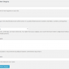
So I added a custom field to the navigation menu for “Font Awesome Icon Name”. All Lucy has to do is enter the name of the icon she wants to use and voilà! She has her custom icon. It gets added to the navigation menu automatically, without any extra work on her part.
Icons for Categories: If you look at the post thumbnails, you’ll see that each one also has an icon. There’s one icon for each category. These icons get added to the post automatically, based on which category (or categories) the post is in. Once again, I wanted Lucy’s blog to be as configurable as possible, so I added a way for her to change and edit these icons for each category. When she creates or edits a category, there’s an extra field for “Icon Name”, similar to the custom menu field.
Have you ever thought about designing your own blog?
If you’re interested in designing and mocking up your own blog (or client’s blog) in Photoshop, I’d love to work with you to turn that into your very own WordPress theme! Feel free to get in touch if you want to talk about working together. As you can see from above, the possibilities are endless! Don’t let your coding limitations dictate how you design your blog.




I love that custom “Latest” thing on the first blog! That is such an awesome idea. That custom about widget is awesome as well. That is too cool. You should consider selling a version of that where you choose your images in the settings and then can edit it as needed as you change your layout. I use the social settings on the UBB but that would be really nice to have.
How would you want it to differ from what UBB offers? I guess I’m just not sure what I’d do differently in a new widget. Is it just the extra space where you can type an “About Me” part?
I like minimalist things when it comes to widgets, so I like to combine them as much as possible. I feel like I have more icons chosen with UBB because it’s an entire widget and having just a line or 4 or 5 icons feels like a waste to me. So having a place for a photo, about me, and very few icons would be awesome. It would give other options for things and would allow and about me on the sidebar without needing a completely new widget for it. I need to just learn how to code and make a few of my own widgets for things. I’ve always wanted either an about me widget like that, or else a widget that would hold the search field and the social icons all in one box together. Maybe even with a place for my email subscription to fall right below the social buttons. Just to keep things clean and put together. I don’t know if multiple widgets effect the load speed of your page or not, but I’ve always wanted the ability to combine them when possible since the widgets always obviously break up in the designs I choose. So yeah, as cool as it would be, it might not even be a popular option now that I think about it. I was on a caffeine high dealing with a teething baby last night so I didn’t really think it through before commenting. I know you need it to be a popular choice to justify making it a plugin/widget.
If I’m understanding what you’d want in the new functionality, that appeals to me as well. On my lifestyle blog, I like having all my social icons in use, but on my book blog, a lot of them don’t really mean anything in that context, so it would be nice to have an aesthetically pleasing way to pare them down, without leaving a lot of funny looking space; the added elements of a mini-bio and small picture are just added candy.
I’ll look into that, thanks!
What does it mean to actually code and design? I thought they were just the same thing HAHAHA Are you more of a coder, Ashley?
No they’re two different parts.
The design part would mean creating the layout and design assets in Photoshop. So it’s just a picture of what the final product should look like, but it’s not a real blog/website yet. It’s just a picture.
The coding part is turning that into a working WordPress theme.
I do both but I enjoy coding more.
Like I said earlier, I don’t know much about HTML or CSS yet, but I think it’s so cool that you’re able to not only code custom widgets, but you’re also able to made those widgets customizable for the blogger.
Thank you Ana!
Those websites are so pretty <3! I can't choose a favorite out of them, they all rock!
But your website is so adorable
Thanks so much.
Ashley, I’m glad you decided to show of your coding work! You work so hard and you’re able to do just about anything – I’ve never had you go ‘nope well that’s not possible’ and that’s just amazing! I had a blast working with you on these and I hope we get to do many more!
Thanks Anna! It’s been wonderful working with you too.
Amazing work! I love the way your plugins make our lives easier and beautiful. Can’t wait to have some and in the future and have a custom design by Anna, love her work! Someone won the lottery of 100millions in Portugal, last week. Why it wasn’t me?! XD Would get you lot of work XD!
Thank you!! It would be so nice to win the lottery… lol!
It’s so awesome to see your coding work! Design is so important, and so beautiful, but without coding it’s just a pretty picture. ♥
Aww, I love that!! Such an awesome way of looking at it.
I need to stop coming here. I just want all of the coding on my blogs! I really love the widgets on the first one.
Haha Full of temptations…
These are all so cool! It’s amazing what you can do with coding knowledge – I want to know how to do all the things!! One day, I will understand I think you should definitely share your coding work. If a skimmer misunderstands – that’s their problem not yours!
Thanks Jade! You can definitely learn all this if you put your mind to it.
I think the option of putting the icons on the categories is so awesome. You make it so easy for a blogger to just input a quick word and have something that looks great. So jealous of these gals!
Yeah adding custom fields to menus and categories isn’t something that’s normally done, but in the right situation it can be super useful!
Ashley, please understand that I bow down to you, and if you’re husband is the Coding God, you’re totally the Coding Goddess. And while I would love to just thrust a big fat wad of cash at you to code me a website, I need to get a big fat wad of cash first. Someday, I’m telling you, someday . . .
*goes back to look at everything and weep inside*
Aw, thank you Shannelle. Vera and I were talking about the lottery up above.. THAT COULD BE IN YOUR FUTURE!!
If i ever win all those millions, i’ll pay you a custom design Shanelle