There are a lot of “rules” when it comes to making business cards. You need to include your name, your blog name, your blog URL, your email address, your Twitter handle, your Facebook URL… Blah, blah blah.
Screw all that.
Having a memorable business card is more important than cramming EVERY piece of information on it.
Which do you like more?
- A business card with zero white space because every inch of it is being taken up with information: blog URL, email address, Twitter handle, Facebook URL, Pinterest URL, Instagram URL… Need I go on?
- A business card that’s unique, interesting, and makes you want to find out more on your own.
I don’t know about you, but I prefer #2. Especially because white space is like candy for designers.
Next month will mark my third year attending BookExpo America and of all the times I’ve been, I’ve collected A LOT of business cards. Never have I typed in the URL to someone’s Facebook page from their card, or found their Twitter profile from their card.
If I do anything with the cards, I check out the blog URL. That’s ALWAYS my first step. And once I’m on their blog, it’s faster and easier for me to connect on Facebook/Twitter/email through the links that are already in their sidebar. Having that information on the card is useless to me because I will never use it.
Give people ONE place where they can find all that information.
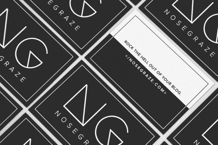
When I set out to create new business cards for Nose Graze, I wanted something simple and bold. I wanted to create a card that felt like a design in itself and not a informational poster.
In order to achieve this, I decided to ONLY put my blog URL on the card. My URL opens up a world of possibilities. They type it in and can find my Twitter, Facebook, Bloglovin’ and other social URLs in my sidebar. They can find my contact page in my menu. I didn’t need to cram all those details on my card when they’re right here on my website.
I wanted something that would catch peoples’ attention.
If I spilled my whole life story and biography onto my card, what need do people have to go check out my site? But by being a little ballsy and mysterious on my cards, I’m (hopefully) encouraging people to find out more. My goal is to make them curious and that curiosity is what will ultimately lead them to my blog.
You don’t have to use all the space.
When we set out to design business cards, our first thought is often, “How can I fill up this space?” It’s easy to fall into that trap, but it’s important to find your way out.
Business cards aren’t about filling up space. Sometimes they’re all about the space and what you don’t include.
If you cover every inch of your business card, it might look messy, cluttered, or disorganised. People won’t know where to look.
Decide where you want people to go and take them there.
Just like you want to guide your readers with a small navigation menu, you want to guide them with a simple business card.
Decide on an action plan.
What do you want people to do after receiving your card? DON’T make a list of 5 things like:
- Visit my blog
- Like my Facebook page
- Follow me on Twitter
- Follow me on Instagram
- Follow me on Pinterest
Because realistically that’s not going to happen. People are going to come home with hundreds of business cards and they’re not going to go through 5 steps for each one.
- Have a business card that INSPIRES and creates CURIOSITY.
- Decide on ONE (maybe two) thing you want the person to do.
If done well, #1 should push people to complete #2.
For me, #2 was visit my blog. That’s what I want and that’s why I included my blog URL.
If your one thing is to follow you on Twitter, then add your Twitter handle. If your one thing is to email you, include your email.
By giving people fewer choices and more of a linear path, they’re more likely to follow through.
I’ll let you know how it goes after BEA 
The beauty of attending a conference multiple times is that you can experiment. This is an experiment for me. Maybe it will crash and fail epicly and no one will visit my site from my business cards. But that’s okay, because there’s always another year.


This year I left the back blank except for a QR code. I have a long URL, so I thought it would help people get to my blog faster
I bet your cards look super sleek!
I love your business card. Simple, to the point, and it makes a statement! Sometimes, less IS really more.
Thank you Julie!
I prefer business cards without an overwhelming amount of information on them too. If too much info is on there, where do I start?! I personally like having my name, website and email address on my business card.
Yes it’s so hard to know what information to look at if there’s so much there. Which is actually important?!
Name, website, and email is great.
Your cards are absolutely stunning!
Thank you Cristina!!
I love your card. For InDesign, we are making a Corporate ID Packages, so I am learning all about business cards.
That’s awesome Jennifer! You take such interesting classes.
Your business cards look fantastic. They convey your tone of voice and make me want to look up your blog.
I work for a marketing company and we do business cards, so much unnecessary stuff gets added onto it. I don’t think you need the logos of every social network you’re on to be on your business card. To me, it seems best to have your URL and, as you say, let people find you on social networks from your website.
Thanks so much Rosie. I’m so glad you think so!
Oh gosh, how horrible that your marketing company adds all that unnecessary stuff. I find that companies often just put the logos of the sites they’re on (without their usernames) just as a, “Hey, we’re on Twitter! But we wont’ tell your our handle.” What’s the point then?!?! These days I think it’s ASSUMED that a company has a social media presence and it’s a SURPRISE if they don’t. So you don’t need to tell people that you do.
Love this! Though I did just make new business cards for conferences with my Twitter and Instagram handles on them–because it makes tagging people easier while we’re still actually at the conference!
Also, your cards are amazing!
I love this. There’s nothing worse than a busy business card! I just got two new business cards and I’m loving them. It has my name, my email and my blog url with pretty and bold designs to help me make an impression. There’s nothing better than a brand new box of business cards
I love the new cards! Simple, yet bold, and plenty of white space to rest the eyes. And don’t worry; I doubt they’ll fail, epicly or otherwise.
I love when businesses make an effort with beautifully crafted business cards. It makes such a huge difference to not only designers but other potential clients as well. Great tips!
Love those cards, I hope you succeed with them. Thank you for all your business card advice. I definitely agree with you, less is more as they say.
LOVE this post + your beautiful cards. Simple, straightforward, and gorgeous. I love that there’s only your site link because like you said, all your social media is right there in the sidebar.
Business card design is like another art form. I just made my first set of business cards for my blog, and hopefully, they turn out okay! I have an added something that I feel like is a wonderful touch, but I won’t say because surprise! ;D
I’ve always wanted to make business cards, even though I’ll never use them. :/ No publicists or etc. here! The most I could probably do is give one to an author when I give them a lettering present during a signing here, but I find that sleazy. So nope, no opportunities to give away business cards for me!
Great ideas on how to differentiate your business cards. So often business cards can just get lost among the masses at corporate events. Design is key in standing out.
Thanks for the great article. I’ve actually had this on the backburner for awhile, but after reading this, I know exactly how I want my cards to look.
That’s awesome Jennifer! Good luck with them.
Thanks for the tip about including a URL on the business card. That does save a lot of room on the business card.
I agree with you that having a memorable and creative business card is important. I also believe it would be great if your design could be related to the industry that your business is in.