Colour schemes can be REALLY inspiring. Sometimes an entire design I make just starts with a single colour scheme. I fall in love with it, I get inspired, and the whole design is focused around it from the beginning. So I thought I’d share a few of my favourite colour schemes at the moment. 🙂
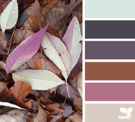
Leaf Palette
Zinnias Hues
Nature Tones
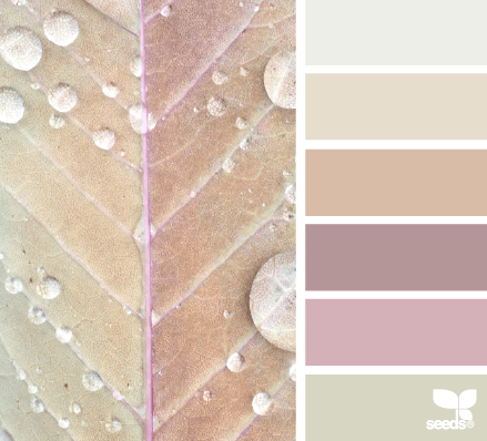
Autumn Dew
This is actually the colour scheme that inspired the Eliza theme. I didn’t end up using all the colours and I did adjust them a little, but the entire theme started when I saw this colour scheme!
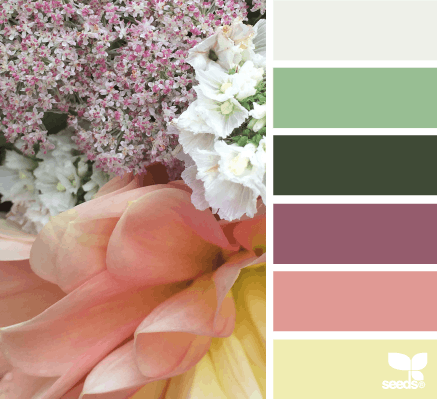
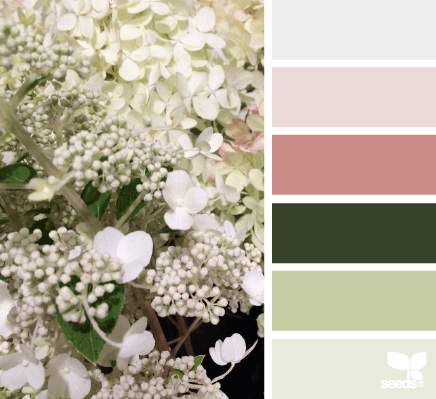
Flora Tones
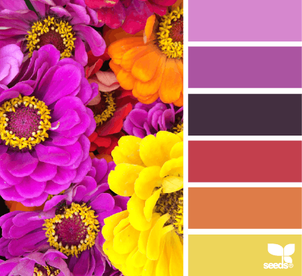
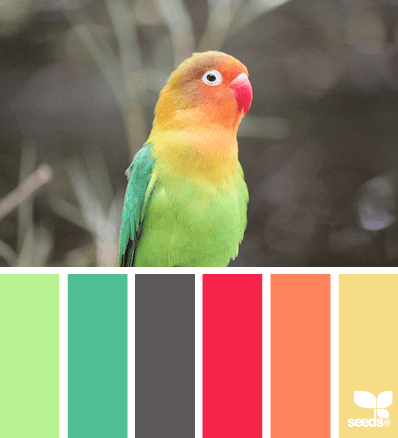
Feathered Hues
Okay I saved the best for last (sort of… I mean, it was in the header). I am ADDICTED to this colour scheme right now. I don’t quite know how to use it, but I have this incredibly strong obsession with it, and I’m afraid it won’t end until I design SOMETHING around it. Now I just need to put the pieces together…

Loving Feathered Hues (and the first one a wee bit too), could totally see post categories using different colours. Urgh, I wish I had more freedom with my blog, but where to start gives me a headache!
Leaf Palette, Flora Tones and Autumn Dew look so… soothing. 😀
My blog design is based on the Bubble Gum palette. Such happy colors to me 🙂
Oh my, so many delicious colours, all so beautiful, I want them all, but have been over to pin the ones I love the most.
Despite how my blog looks, these are literally my favorite color schemes. I love toned down colors.
I love the Featured Hues color scheme. It’s so beautiful. I’m sure you’ll figure out a way to use the colors.
Whoops, I mean Feathered Hues.
I love a good colour palette! <3 Colors are always the first thing I decide on when I do designs- my starting point. I absolutely love the flora one! I usually prefer pastel colors. 😀
Nature tones and Autumn Dew are my two faves.
I adore color schemes that are soft and gentle like ‘Autumn Dew’.
‘Feathered Hues’ is too colorful for my personal taste. But a great catching website can be designed around it. Can’t wait to see the result.
Ahh. Now I’m in love with this site!!
I love all of these colors. They are very inspiring. 🙂 I’ll have to try working with some of them.
What a beautiful post! Really inspiring! Especially since I am hoping to pick a new color scheme for my blog soon! (right now it doesn’t have much of a “theme” necessarily :))
Thanks for sharing!!
Joyce
If I weren’t so happy with my color scheme right now, I would totally change to the Autumn Dew one! The last one is too bright for me, but I can see the appeal 🙂
I love love love color schemes and mood boards! My favorite of these is probably autumn dew. I also really like the ones that use different textures like foil.
My favorite part of (fashion) design school was putting together a color scheme.
Have you checked out Salted Ink? She does blog branding and has the prettiest mood boards and color schemes. http://saltedink.com/blog/
Flora Tones and Autumn Dew are my fave! I think it’s because of the purple tones hehe. I love everything about purple/violet/lavender.
Love autumn dew and leaf palette! In general, I like any color scheme that subdues bright colors with either greys or browns. I definitely tend towards simple schemes with a bright color, a grey, and white. I think 3 of my blogs have that combo lol. I have been wanting to add another brighter accent color to my book blog though.
I’m loving Feathered Hues so much. Such a fun colour combo. 🙂 Kinda makes me want to rethink my whole colour scheme.
Color schemes are so much fun to look at! Thanks for sharing the site! I might use one of the palettes for my next newspaper portfolio.
ColourLovers is also a great resource for picking a scheme.
Thanks for the suggestion, I’ll check that out!