The Annie Sloan Hands logo (pictured in the photograph above) is a trademark of Annie Sloan Interiors Ltd.
You know what one of the biggest must-haves is when designing your own logo? A huge bundle of inspiration. That’s why I love those super cheap bundles of hundreds of fonts, vectors, and other assets. They’re so much fun to peruse and get inspired!
In honour of The Hungry JPEG’s most recent bundle I’m going to teach you how to create your very own logo design.
Recommended programs & resources
- Photoshop
- Illustrator
- Bridge (optional)
The Hungry JPEG’s July bundle(check out the otherbundle available now!)
Ready to get started?
Step #1: Install every single font!
This is where I like to begin. Fonts are my biggest inspiration. When I see a font I like, I can start to put together all the other pieces in my mind. So let’s start here!
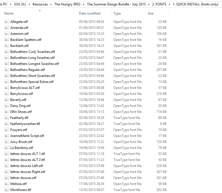
The Hungry JPEG now has a “Quick Install” feature for fonts, where you can easily install all your new fonts at once!
I just dragged all the fonts into my “Fonts” folder, but the instructions for each computer may vary slightly. Luckily they also include some Quick Install instructions in the download pack!
Step #2: Open up Photoshop and play with fonts!
Here’s where things get awesome.
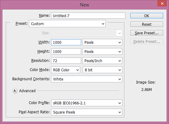
I open up a nice, big Photoshop document. In this case I’m going with 1000×1000 to give me plenty of room to play.
I like to start out with a neutral colour, like #333333. It’s a nice, dark charcoal. Just a few shades lighter than black. Because at this point, I don’t have a colour scheme in mind yet.
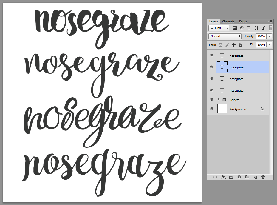
Then, start writing your blog/business name in each of the fonts. I keep each font on a new layer so I can easily toggle between them. As I go, I delete the ones I’m not particularly interested in.
Here are the choices I ended up with:
From top to bottom, those fonts are:
- Beverly
- Lettres Douces
- Violla
- Sortdecai Handmade Script
Right now I haven’t decided which font I like best, so I’m going to move onto the next step, which is getting inspiration from the graphical assets.
Step #3: Finding graphics to accompany the text
This is when I start perusing through the Graphics folder included in the bundle.
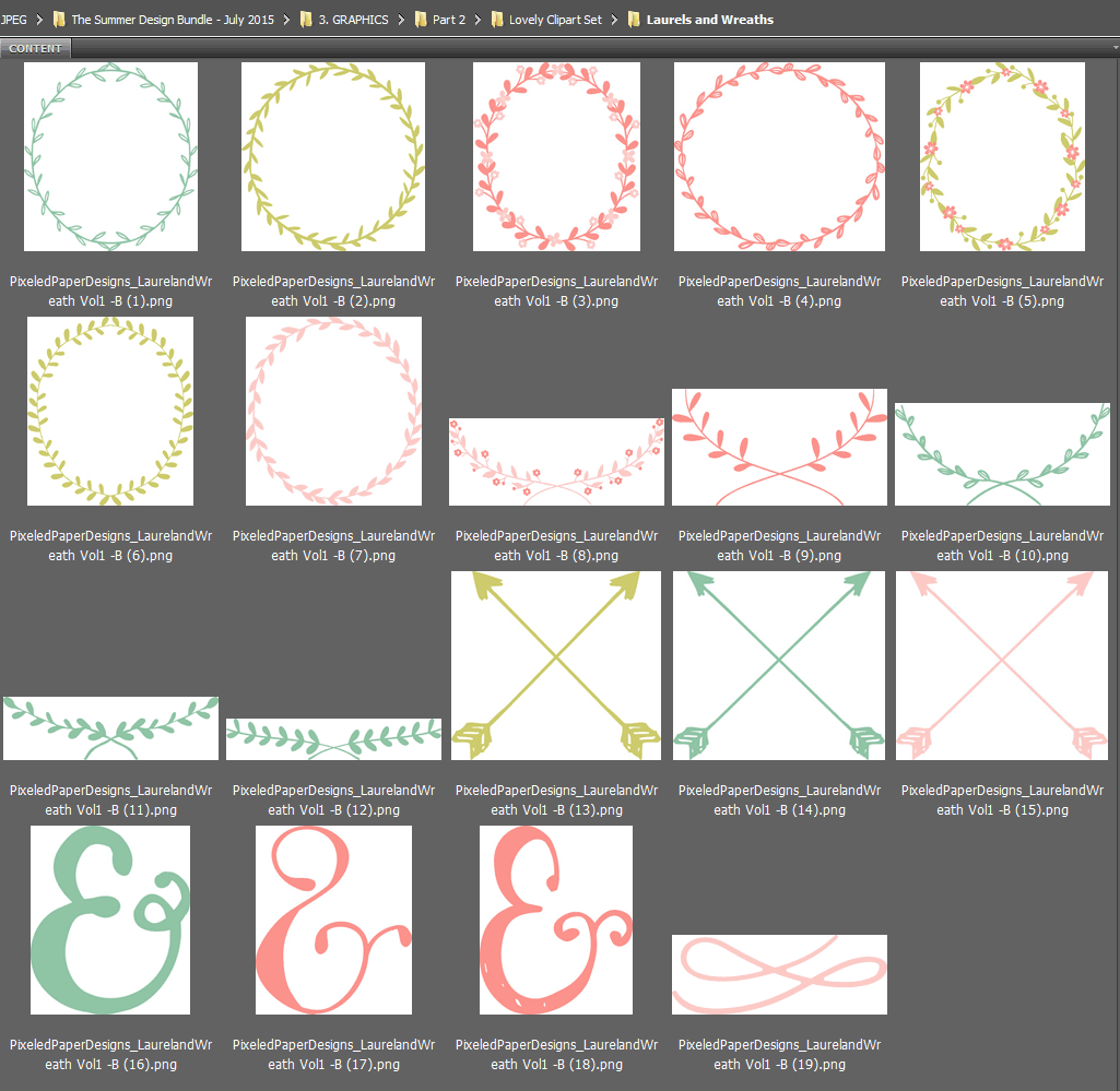
Typically what I do is open up the folder in Adobe Bridge. I do this because Bridge provides great previews of all files (PSD, Illustrator, etc.).
I literally just browse through the folders looking for inspiration. I start pulling together and exporting any assets that interest me. They don’t have to make sense or go together, I just start collecting ideas.
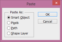
Any time I come across a graphic I like, I paste/export it into a blank Photoshop document, because Photoshop is my program of choice. In order to preserve the vectors, I make sure to save them as Smart Objects whenever possible.
The smart object allows me to continue resizing vector graphics because it doesn’t rasterize them (as it would had I selected “Pixels”).
Each asset is also on its own layer so I can easily move things around and copy them to another document.
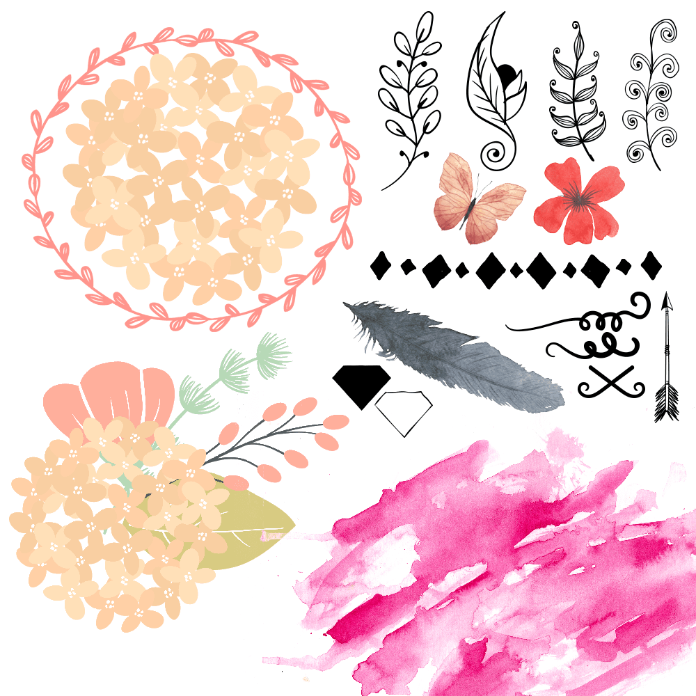
Here’s what I ended up with:
As I said, these are all very different. It’s kind of a wild collection, but that’s okay. I may not use them all in my logos, and I certainly won’t use them all in one logo.
Step #4: Mix and match fonts and graphics to create tons of different logos!
Once you have all your graphics, it’s time to put them together with fonts!
The goal here isn’t to just create one logo and stick with it. You want to create tons of different logos. We do this because your first logo probably won’t be the best or your favourite. But the more you experiment and play around, the better your logos will get. It’s better to give yourself plenty of options.
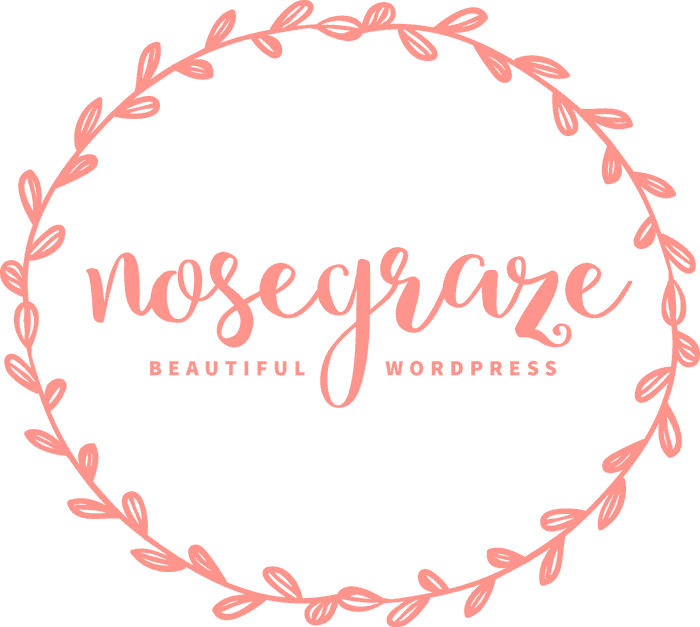
Logo #1
It’s super simple and I even used the colour that came with the laurel (it’s gorgeous!). You’ll notice that I paired it with one of my chosen fonts (Lettres Douces). But there was a lot of empty space around “Nose Graze” so I also added a tagline in Source Sans Pro.
Logo #2
This one is using one of the floral graphics. I went with the same font as in logo #1. I think I’m starting to really love this font! I’m not 100% on the colour of the Nose Graze text though. I used the colour of the branch, but It seems a tad out of place.
Logo #3
I’M MASSIVELY IN LOVE WITH THIS ONE!! This one is the most “me” so far. It’s easily the simplest one so far and it took all of two seconds to make, but I LOVE IT!!
This time I used the Sortdecai Handmade Script font. I knew straight away that the whole “nosegraze” I had written out before wouldn’t fit, so I cut it down to just “ng” and it fit in the diamond perfectly!
I could even do a cool inverted version with the filled in diamond:
Keep going until you’re happy (or even past that point)
I’m super happy with my diamond logo, but I could even keep going if I wanted. True, the diamond logo may still be my favourite, but you never know what else will come along.
Typically when I create logos I have a very long process:
- Experiment
- Find one I love
- Keep experimenting
- Start trashing the ones I no longer like
- Let the logos sit for a few days
- Come back to them with a fresh set of eyes
- Keep tweaking and adjusting
And I do all that until I’m 100% happy with a logo. Otherwise, sometimes I make a logo, love it, but then three days later I realize that I’m already sick of it. So it’s important to let those logos sit for a while to ensure that you’re going to keep loving them long-term.
Looking for more logo design tips? Download my free list of logo design dos and don’ts!
I’ve put together a list of 7 things you should NOT do when designing your logo and 7 things you SHOULD do. Click the button below to get the list.
Your turn!
It’s time to open up your bundle of fonts and graphics, load Photoshop, and get to work! Feel free to share your results below. 🙂


I love this post for 2 reasons:
1. You recommend The Hungry Jpeg bundle, I am addicted to their bundles and am thrilled that this month they included graphics as well as fonts for me to enjoy (I don’t know why I keep buying their bundles, though. I am not a designer or anything, I just have an addiction to fonts and like playing around with things in photoshop from time to time.)
2. You give the absolute basics and what you are essentially saying is ‘mess around and see what happens’ which I think is the most important rule for designing anything. It won’t always work out, but you won’t know until you try.
Thanks Becky! I don’t even design a whole lot any more either but I’m still ADDICTED to their bundles. I can’t stop.
And yes, “mess around and see what happens” is practically my motto. Every single one of my designs just comes from experimentation like this. I end up with a ton of rejects and bad ideas, but eventually I get to one that I love. 🙂
I love these. Especially logo #2. So pretty.
Thanks Carrie! Those floral graphics are to die for. 🙂
Hi, Ashley – Thank you! I always learn so much from your posts. 🙂
@dino0726 from
FictionZeal – Impartial, Straighforward Fiction Book Reviews
I’m so glad to hear that Diane. 🙂
Wow, that bundle is amazing. I think I have to buy it. It seems crazy not to.
I know! I feel that way about all their bundles. I can’t stay away!
I LOVE this bundle!!! Man I really may just have to get it. It’s so cool that they have a great mix of fonts and vectors. The variety also makes it really easy to switch around different elements and come up with a ton of really different looks for logos. I’m currently trying to redesign my own header & such, so I’ll definitely be keeping in mind your awesome tips.
As always, thanks for such helpful posts, Ashley! <33
Yeah I love the variety. I’m a huge sucker for all the fonts!
Great post (as usual) 🙂 You know I’m a big fan of your Zen-feminine designs 🙂 just told my family they can get me your plugin for my birthday 🙂 can’t wait!
That’s so awesome! I hope you love it. 🙂
Holy crap. I clicked thru to bundle. That’s a lot is stuff you get for $29. I may have to buy this bundle even though I’m not sure what to do with it. Lol
I know! I buy most of the ones I see because I can’t help myself. 😀
I’m a Creative Market girl and although I’ve heard of the Hungry JPEG this is the first time I’ve checked out their site! So cool! I love bundles and they’re giving 25% off your first purchase. Thanks for the recommendation Ashley! Love the fonts you chose too! 🙂
Late to the party, but as far as fonts go, I’ve found http://www.wordmark.it to be an invaluable tool. It allows you to type in a word or phrase and then shows you what it looks like using all the fonts you have loaded on your system. I’m able to easily see if some letters look odd or if a necessary number or symbol isn’t included in the font I’d like, all before even opening Illustrator or Photoshop or having to scroll through each font. Aside from showing like one small ad, I can’t figure out how they support themselves, since there’s nothing to download or sign up for.
Great ideas! Another option for those of us that don’t use Photoshop, or can’t afford it yet, would be to get those graphics and use a free online service like Canva.com. It’s free if you upload your own graphics/images, plus it has templates for cover photos of several social media sites; all you have to do is drag and drop your logo’s components into the template, tweak a few things, and you are good to download it and add it to your site. I use it because it’s easy, free (unless you want to use paid images), and I can usually find something that I like.
Thanks for sharing your process! Semi-random question: would you recommend installing an older Photoshop or signing up for the Creative Cloud subscription for occasional “artists” (read: fiddlers), or just sticking to free programs?
An older version can work for you perfectly fine. It won’t have a lot of bells and whistles, but I don’t use tons of Photoshop features anyway. An older one may not have the Content Aware Fill feature though, which I adore. Awesome for editing random crap out of photos.
A lot of people swear by the free programs, but I’ve been a Photoshop user my entire life and simply can’t use anything else. So sadly I can’t offer much of an unbiased opinion on that. 🙂
Love this how to. And Hungry JPeg is almost an addiction. I love their bundles. I was having a hard time understand photoshop but your step by step definitely helped, and I created a new header for the blog. Thanks for your awesome how-to posts!
It looks great Katrina! Go you! *high five*
Rate 5 star, Thanks for your sharing !
Honestly one of the best and most helpful posts I’ve read. I loved the idea about opening a blank sheet on Photoshop and having a few different fonts on it to see which one is the best. Very smart and unique!
I’m so glad you loved this Anisha. 🙂 Good luck with designing your logo!
Thank u Ashley… You did well,
Ahh thank you so much for explaining this! Seriously I have been looking for an easy explanation for ages!
You’re so welcome! 🙂
Just came across your post and I love it! I’ve been working on a logo for awhile now. I have it narrowed down, but was wondering the best way to save the logos.
That’s awesome Jennifer!
When you save them for your website? You’ll probably want to “Save for Web” in Photoshop and save as PNG.
Hi Ashley!
Im starting to play around with some logo design (no experience whatsoever!) and I had a question for you. I found your tutorial super straight forward and understandable! If I dont have photoshop, is there another program that is less expensive I could use to design something like this?
You could look into GIMP and/or Canva. 🙂 I haven’t used either one but I know they’re both popular and widely used!
what a geat post Ashley!! u help me lot in how to create my own logo (I was stuck in that way.. -.-” :D) hahaha.. Love your other post too.. 🙂
This is a great post for those who want a logo for their business, but knows nothing about Photoshop. Its really helpful !
Nice tips, love you ;* ashley
Simple and creative..
Live tour first logo design the most. The diamond one is also nice.
Thank you!! This was very simple and helpful. I’m dying to dig in and get started with creating my own logo. ???
I’m learning to create my own logos, and this is really helpful! Thank you.
Thank you for sharing this. I’m sure you share regularly but this is something I am absolutely new to every time I have tried to start a blog I have horribly failed this gave me such good insight and I do appreciate it and I look forward to your next post
Thank you for this post it was very inspiring. I have had such a hard time trying to start a blog not knowing exactly what I’m supposed to be writing in regards to my business I do I did start a personal blog but that’s been several years ago and I haven’t kept up on it so this is something that was very informative to me and I definitely appreciate it and I look forward to your next post
Awesome tips ,just the jumpstart I needed to begin redesigning my logo!Thanks for sharing.
Hi! I stumbled upon you through Pinterest. I need to create a logo for my website that doesn’t exist yet! How do I get started?!
Hi, Ashley-This is awesome !!This is SUPER helpful.I’ve been curious about this. Lovely tutorial too.
Thank you so much Ashley for sharing such a nice tutorial with us.