One of my favourite parts about blogging is making fun graphics to promote books and showcase in my image slide on my homepage! I’m going to walk you through the steps to creating one of these banners. Although this tutorial is specific to a certain image, the concepts can be applied to create your own headers for books or for memes like Stacking the Shelves!
Let’s get started!
Requirements
- Access to Photoshop. My tutorial is based off Photoshop CS6 Extended, but earlier versions of Photoshop are capable of achieving the same results (though instructions may vary slightly).
- A high quality, large version of the book cover for your banner.
- No Photoshop experience required! My tutorial will tell you all you need to know!
The Final Product
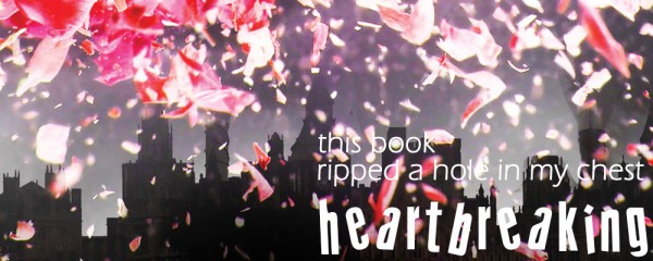
Let’s take a look at what we’ll be making in this tutorial! This is the final product (click it to enlarge):
Step 1: Finding A High-Resolution Book Cover
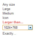
First, we need to find a high-resolution version of the book cover. In my case, I need a large version of the cover of Black City by Elizabeth Richards. Let’s hop over to Google Images and do a search for “Black City by Elizabeth Richards”. But before you go picking out images, we need to filter our results! On the top right, click the cog icon and select “Advanced Search”. Down where it says “image size”, click “any size” and select the size image you want. Since I’m creating a very large image, I’m going to select “1024×768”. Press “Advanced Search” at the bottom, and now all our results will be large images!
Image Size on Hover
(Click image to enlarge)
If you hover over the image you want, you can see how large it is (red highlight in image to the left). The image I have selected is 1650 x 2475 pixels! That’s perfect for my project! I’m going to save the image to my desktop and then open up Photoshop.
It’s time to decide how large you want your graphic to be. If in doubt, start large! You can always make an image smaller later, but you cannot make it larger! (At least not without making it ugly and pixellated.)
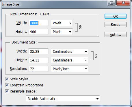
Hit CTRL+N to open a new document, and enter in your dimensions. For my graphic, I am going to open up a new Photoshop document that is 1000 x 400 pixels.
Step 2: Position the Background
Now that we have a blank canvas, it’s time to paste our large book cover in the document! Open up your large book cover image in Photoshop, hit CTRL+A to select the entire canvas, and then CTRL+C to copy it, then switch back to our empty graphics document and press CTRL+V to paste the image in.
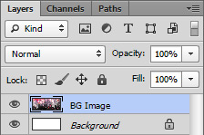
Pasting in the image should have automatically created a new layer. Find your layers panel on the right, and locate your new layer. To help us stay organized we’re going to name all our layers! So rename “Layer 1” to something a bit more descriptive. I chose “BG Image”.
Now you can position the image however you want! You can move it around using the Move Tool (hit V on your keyboard to select it). If your image is larger than your canvas and you want to shrink it down, you can resize it using the Transform feature. To activate Transform, hit CTRL+T. Now if you hover over one of the corners, your cursor will turn into a diagonal line with arrows on each end. Make sure you hold down Shift while resizing to ensure that the image retains its proportions!
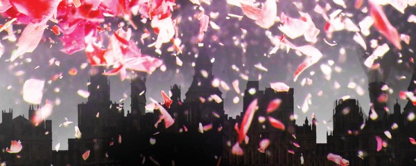
Here’s what my graphic looks like so far:
Step 3: Adding Text
Now it’s time to add some text to our graphic! Depending on what style you’re going for, sometimes a normal, pre-installed font will work fine. But on other occasions, a custom font is much more interesting and will still fit the style you’re going for!
For a great selection of free fonts, I recommend dafont.com. This site has a wide variety of unique fonts that are free to download! So have a look around and choose your fonts.
For my graphic, I have two fonts selected: Eras Light ITC (already installed on Windows), and Crazy Style from dafont.
To add your font, press T on your keyboard to switch to the Type Tool. Then simply click and begin typing your text. You can use the settings at the top to change your font family, font size, and font color.
Here’s an update on my graphic:
Step 4: Text Effects
Photoshop Layer Styles
(Click image to enlarge)
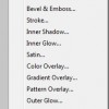
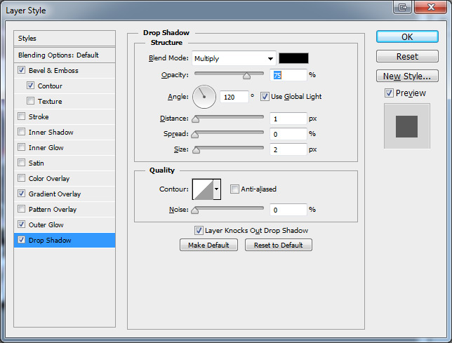
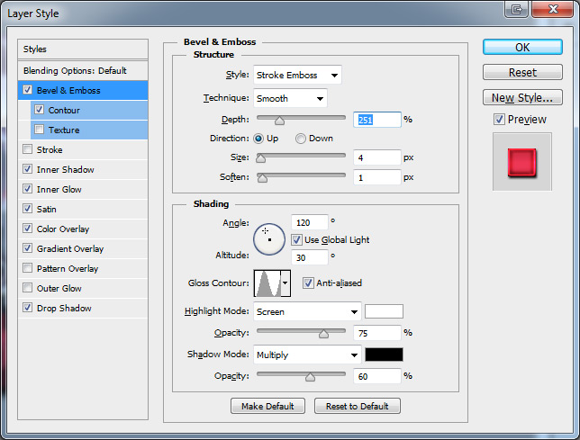
Looking at my progress image above, the text isn’t very easy to read—is it? We’re going to fix that with text effects, using layer styles! Select your first text layer and click the “fx” button at the bottom of the layer panel to bring up the layer styles. Select “Drop Shadow”. This will bring up the layer styles menu.
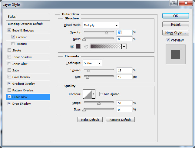
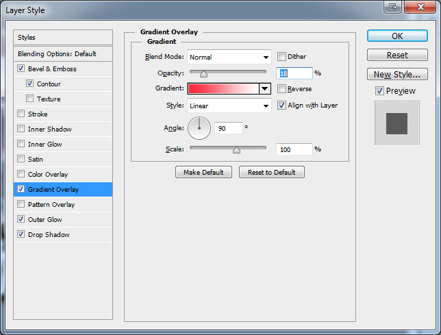
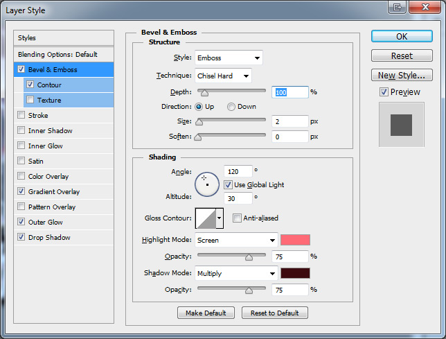
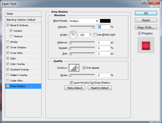
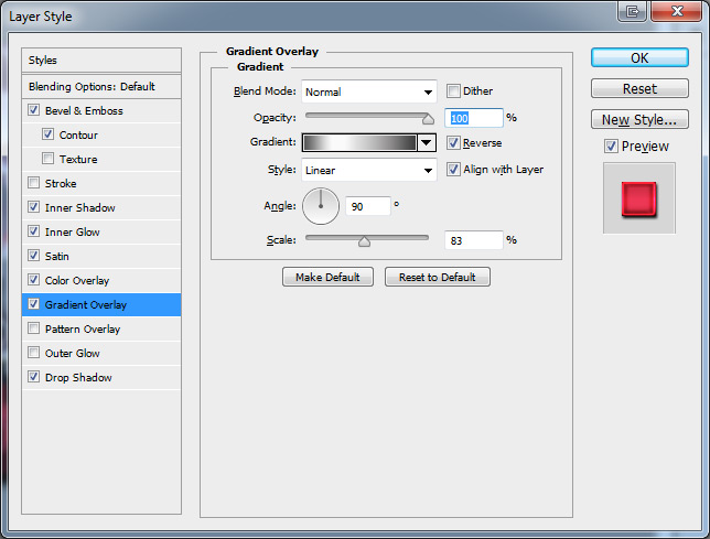
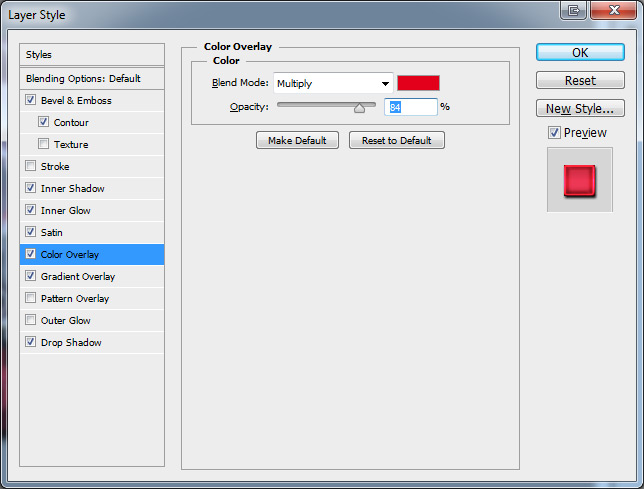
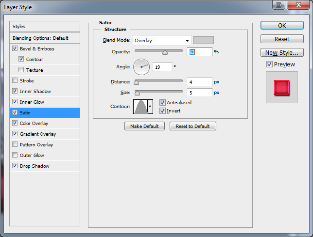
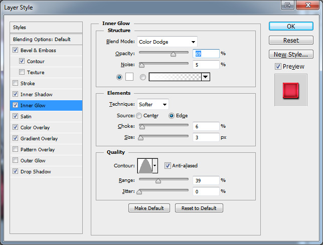
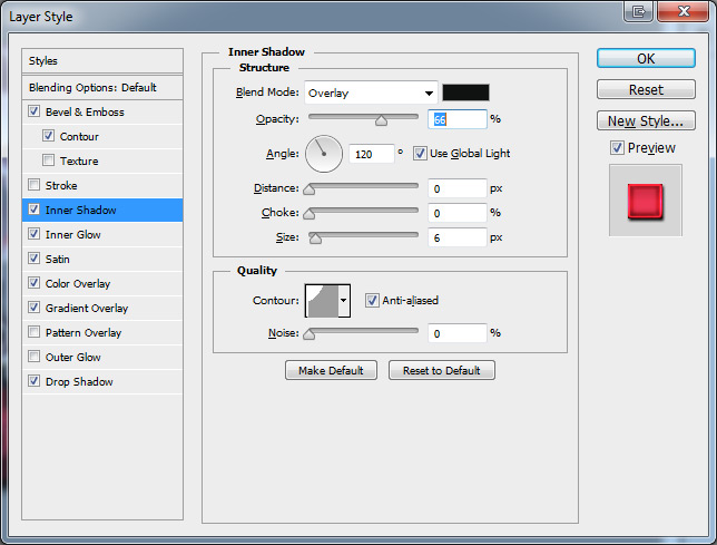
First, I’m going to work on my “This book ripped a hole in my chest” text. Feel free to copy my layer styles or use your own—it’s up to you! I would encourage you to experiment and see what you can come up with! Below are the layer styles I used. Click each image to enlarge it.
Now it’s time to work on the text effects for “Heartbreaking”. I want this text to stand out more, so we’re going to make it red, pink, and all kinds of awesome! Again, feel free to use my layer styles or you can experiment to create your own!
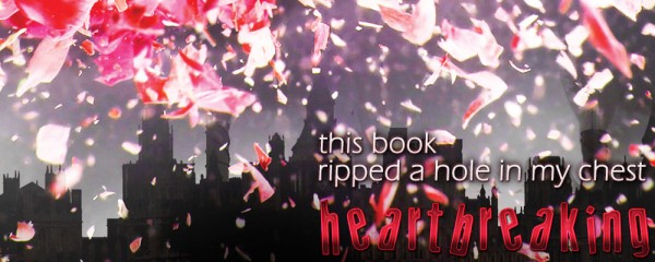
Time to take a look at our progress!
Step 5: Book Mock-Up
Next, it’s time to add a mock-up of the book! Most good Photoshop mock-ups of books cost money. The one I’m using is called 3D Book Mockup and is available for purchase on GraphicRiver.net. I won’t explain how to use this mock-up since there are already instructions if you decide to purchase it.
If you would rather not use a mock-up, you could always just paste in a smaller image of the book cover instead! It’s cheaper, easier, and still sends the same message. But for my example, I will be using the book mock-up!
I pasted my book mock-up into my graphic document. Make sure you don’t move the wooden background layer over as well! Name your new layer—call it something appropriate like “Book Mockup”, and place it beneath the text layers. Feel free to resize, move, rotate as necessary!
With my mock-up in place, I decided to add a little bit of an outer glow to make it stand out. I used these settings:
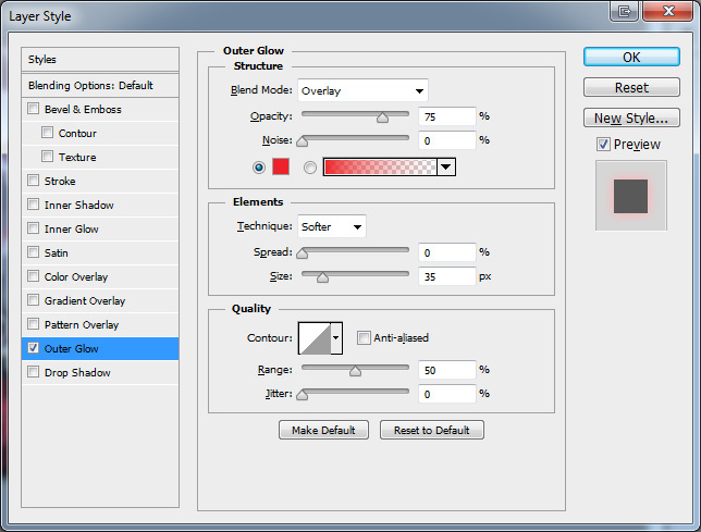
Outer glow with colour #ec222a
We’re almost done!! Here’s what it looks like so far:
Step 6: Blending It In
I love the flower pedals on the cover of Black City and I decided I wanted to make them look a little more 3D. How can we do that? By making it look like flower pedals are falling both in front of AND behind the book mock-up!
Make sure your layer order is like this:
- Text layers
- Book Mock-Up
- Background Image
Then duplicate your background image layer by selecting it and pressing CTRL+J. Then, move the new background layer over the book mock-up layer. So your book mock-up should now be hidden.
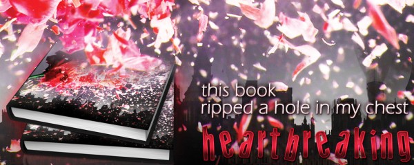
Next, press E to switch to the Eraser Tool. To start with, you’ll want a big, soft brush with 100% opacity. Erase over the bottom part of where the book mock-up is. Stop when your image looks like this:
Then, bring the opacity down to about 40% and make your brush smaller. Keep erasing until there are still some flower pedals showing through, and you’re happy with the results!
All Finished!
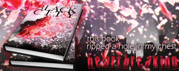
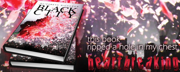
Congratulations! Now you’re done! If you followed along, hopefully your graphic now looks like mine:
You can apply all these same skills and methods to creating different banners for other books and even memes! Feel free to post your results in the comments section.


Wow, the banner looks awesome!! I really like how you share the use of text effects in the tutorial. Thank you very much!
It’s my pleasure!
Wow, thanks! I’ll be doing some photoshop attempts tomorrow
I can’t wait to see what you come up with!
Thanks for this! I’m going to try this one.
Love, love your blogging tips…
I’m glad you like them!
I have always wondered how people created real-looking books in their posts – now I know it’s a mock-up!
Another great tutorial Ashley – thanks!
You’re welcome!
So freakin cool. I wish I could redo college and become a graphic designer or something because this stuff is so cool. Stupid business degree.
Get Photoshop, mess around, read some tutorials, practice, practice, and you’ll have graphic designer skills in no time! No degree required!
So helpful! Thank you so much. I don’t have Photoshop right now, but it’s on my wish list.
I hope you manage to get it soon! It’s really an amazing program. You’ll get addicted!
I loved your post and decided to give a try. Didn’t use all your itens but it was fun and now I want to experiment more on Photoshop. Here’s my banner:http://s741.beta.photobucket.com/user/marie20_photo/media/Untitled-1-1.jpg.html
Yours turned out really great Mariana! I love it. Thanks for sharing!
Great tutorial! I like the book mock-up thing…I might have to invest in that!
I used this as a guideline to make a bit of more interesting Facebook header. It turned out…decent…ish.
Not sure if I should link…don’t want to seem as if I’m trying to get people to go to our facebook page. But as it’s pretty much not used anyway, I feel it’s okay if I paste a link: http://www.facebook.com/whatchyareading
Also, I found an okay looking free book mockup which I recommend for people who want to see how it easy it is to use before/without spending any money. Don’t want to link…as I think my comment is on the verge of looking like spam anyway, but if you just google it, I’m sure you’ll find some good ones. And I’ve never used one before in my life and it was super easy!
Thanks Ashley!
Thanks so much for sharing your work Caitlin! Great job! And yes, I love how easy the book mockups are to use. It’s AWESOME!
Thanks for this!!! Trying my hand at these right now
Good luck, I hope it helps!!
What’s good tutorials to buy to learn how to make banners and web pages
I love this, and I want to try it, but I have question first: Did you buy the full version of Photoshop or is this the test version you can do such amazing things with???
I just bought photoshop yesterday – I can’t wait to give it a try!!
Woohoo! Have fun with it
Hi, I went to GraphicRiver to buy the 3D book Mockup and I saw there are two different licenses, regular and extended. If I simply want to make some banners for reviews in my bookblog, is the regular license enough?
Thanks a lot for your tutorial, it’s amazing!:)
Yep the regular license will be fine for you!
Hi Ashley, is this tutorial applicable to creating mini-series banners like what I found in this blog Mini-Series Banners ? After seeing them for the first time, I have this crazy obsession about making one since there are some book series that I love but do not have a banner available in that blog. And as the owner said, she’s not accepting requests anymore so I thought of making my own.
Thanks, Ashley. Your site is so helpful.
Hmm I wouldn’t really say it’s applicable. This tutorial is more for creating artsy banners, but mini-series banners usually just have the book cover and title.
But, I could definitely do a new tutorial on how to make mini-series banners! Really the most important step for that is matching the font, and I definitely have some tips on how to do that.
Yay! Thank you so much for that Ashley. I’ll be looking forward to that definitely. Can’t wait!
Thank you for this tutorial! I also purchased the cover mock up and I’ve been playing around with that. How do I make the background transparent? The cover looks great but the background is coming out white and I just can’t figure out how to get the background transparent.
There would be a background layer and you just have to delete/hide that.
Thank you for the hint. I got it to work like I needed. Thanks Ashley.
Hi Ashley,
which photoshop prodict are you using because I’, trying to download the Adobe one and its a nightmare….it keeps failing.
Thanks
Photoshop is an Adobe product, so that’s the only one that exists (there’s no alternative version by a different company). If you’re having problems, you’ll have to use Adobe’s customer support to work it out.
Since fifth grade, I’ve been using Gimp for all of my photography/graphic design needs. When I joined the newspaper staff, I started using Photoshop to edit photos whenever I was in my advisor’s classroom, but this is the first time I’ve had Photoshop on my own laptop at home. And, let me tell you… I am never going back! Designing this banner took me fifteen minutes (give or take) and I’m very happy with the result: http://thenerdyjournalist.files.wordpress.com/2014/01/unhingedbanner.png
Very nice job!! GIMP is okay for a free program, but Photoshop is miles better!
Hi Ashley ! Excellent tutorial for making banners for books in photoshop you have shared, great tips. Can you suggest any resource/tutorial or tips for creating watermark in photoshop ?? TIA