
Charlotte from Thoughts and Pens requested a tutorial on how to make mini-series banners. Here’s an example of what we’ll be making:

Let’s get started!
Requirements
- Photoshop – You may be able to use another image editing program, but for this tutorial I am using Photoshop.
- A book cover image.
- The ability to download and install new fonts on your computer.
Step #1 – A New Photoshop Document
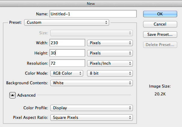
To start with, let’s create a new Photoshop document with the right dimensions. You can choose any dimensions you want, but for this tutorial I’m going to go with 230×30 pixels.
Now we need to add something to it! Time to go image hunting.
Step #2 – Adding the Book Cover
Hop on over to Google Images and do a search for the book title and author. I’m going to search for crewel gennifer albin. Find a decent-sized copy of the book cover you want. I usually prefer to get the largest one I can find, because you can always make a large image smaller, but you can’t make a small image bigger (without making it look like crap).
So, copy the image, then paste it into our Photoshop document and position it the way you like it. Here’s how mine looks so far:
But I don’t like that weird stripe on the left, so I’m going to get rid of it. I’m going to select it with the Lasso tool, then go to Edit » Fill, make sure it’s set to Content-Aware and press Okay.
And now it looks like this: (this is zoomed in, which is why it’s pixellated)
I’m still not particularly happy with that dark blot so I’m going to use the Eyedropper Tool (press i on your keyboard) to pick up that pink colour, then switch to the brush tool, drop the opacity down to 60%, and paint over it.
Now it looks like this:
That looks pretty good. Now it’s ready for text!
Step #3 – Finding & Installing the Font
Before we can add the text, we have to try to figure out what the font is. To do that, go back to Google Images and get that large copy of the book cover. Copy it, and paste it in a new Photoshop document.
Using the Magic Wand Tool (press w on your keyboard), select each letter of the book title. After you make your selection of the first letter, you will have to hold down Shift when clicking on the other letters to ensure that you have them all selected at once.
When you have all the letters selected like in the image above, copy them (CTRL+C) and paste them into a new Photoshop document with a white background. Now, with your new pasted layer selected, click the Lock Transparent Pixels button in the layers panel.
Then, press d on your keyboard to reset your colours to the default black and white. Then, with your font layer selected, press ALT+Delete on your keyboard. This should make your text black, while maintaining a white background.
Then, go to File » Save for Web and save the image to your desktop (JPEG format is fine).
Once you have your font file saved, go to http://www.whatfontis.com/. This website can be used to determine the font name of the font in an image! Upload your newly saved file there and make sure you have The background color is lighter than the characters color selected. Then press the big Continue button.
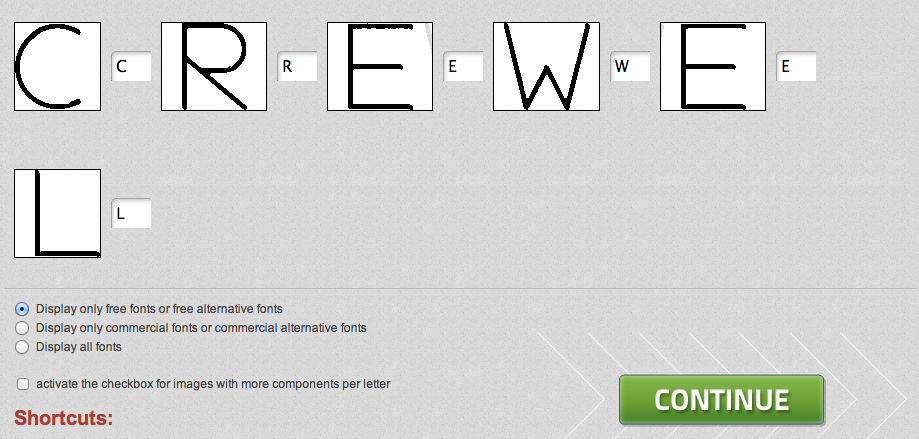
On the next page, you will have to type in the text for each letter. Sometimes one letter might get split up into two or more boxes. If that happens, drag one box on top of the other to combine them.
You may also want to select the box for Display only free fonts or free alternative fonts. This will ensure that the results only show free fonts, rather than fonts you have to pay for.
When you’re ready, press Continue.
You will get a very long list of possible fonts. You may not find the exact font, but odds are you will find a font that is very similar.
For my mini-series banner, I decided to go with eurofurence light. It’s not perfect, but I can tweak it a bit in Photoshop to make it look close.
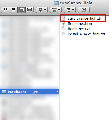
When you’ve found a font you’re happy with, click the link called: Click here to download the font. You will be taken to a new site where you can download the font. It will probably be downloaded as a .zip file. Open up the .zip file and find the font file. It will have a font extension like .ttf or .eot or .otf. Mine is .ttf:
Double click on the font to install it and press the Install Font button. Then, return to Photoshop.
Step #4 – Adding the Text
Now return to your mini-series banner Photoshop document. Switch to the Type Tool by pressing t on your keyboard. Now click inside the banner to add your text. Don’t forget to change the font to the typeface you just downloaded!
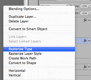
But you’ll notice that the W looks totally wrong for the book cover font. I need to edit it! Right click on the type layer and select Rasterize Type. This will allow us to modify the font file.
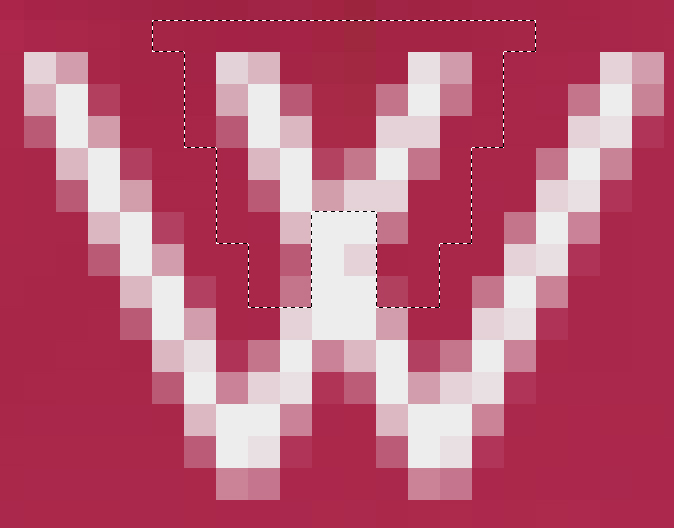
Next I’m going to zoom in as close as I can (CTRL and +) and switch to the Polygonal Lasso Tool. I’m going to select the parts of the letter “W” that I don’t want. When you’re happy with your selection, press Delete.
I also noticed that the “W” on the book cover is much thinner length-wise. Select the entire “W” using the Rectangular Marquee Tool (M on your keyboard). Then, transform it by pressing CTRL+T. Using the toggle on the right-hand side, drag the “W” to the left, thus making it less wide. When you’re happy with the results, press Enter to commit the changes.
But then you may notice that there’s a big gap between the “W” and the “E” like this:
Using the Rectangular Marquee Tool again, select the “E” and the “L” together. Then switch to the Move Tool and drag the letters to the left to remove the gap.
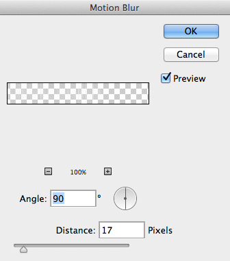
Next, we’re going to add the motion blur. If you look closely at the cover of Crewel, you’ll notice that the letters blur outwards. To to this, duplicate the text layer, and move the duplicate below the original. Then, go to Filter » Blue » Motion Blue and use these settings:
I then decided to change the blur layer’s style to Overlay and then duplicate the layer. I also decided to move the text so that it was all on one line, because I thought it looked better. Here’s what I have so far:
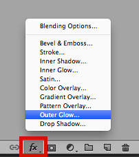
Next, I decided to add a bit of styling to the text. I want to add a dark outer glow and a bit of drop shadow. With your text layer selected, go to the layers panel and click on the button for Add a layer style, then in the new menu that pops up, select Outer Glow.
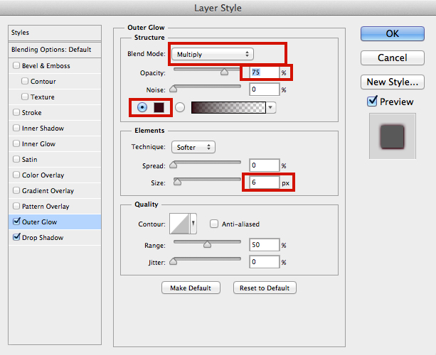
You can use whatever settings you want, but these are the settings I used:
Colour: #350713
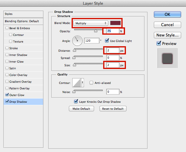
Then, click on Drop Shadow to add that style. I used these settings:
Colour: #722438
Aaaand we’re done!
Here’s my final result:
And looking back at this guide, the text was clearly the hardest and lengthiest part. Once you’ve done that, it’s super easy to add background variations!






Oh my god this was so helpful! Please do more Photoshop tutorials like this in the future! I’d love to be able to make my own graphics for my blog eventually, but I’m absolute crap at Photoshop and haven’t the time to take a proper class or anything, but this was so easy to follow!
what version of photoshop do you use? I know the edit->fill but the content-aware is a new one on me!
I use Photoshop CS6. I believe content aware fill was introduced in CS5. You don’t really need the content aware fill for making banners though. You could easily achieve the same results just by manually painting over it (as I did a bit anyway!).
ah! i use CS3. Your tips on the working with the fonts are VERY helpful!
EEEE, so cool. thanks girl.
OH MY G! I couldn’t believe I’m seeing this right now! THANK YOU SO MUCH, ASHLEY! I have bookmarked this one just like your other tuts. Your Photoshop prowess is unrivaled. <3
The whole font thing procedure really looks meticulous but the final product is sooooo adorable that all I wanna do is start making them now. Haha. And see if I can make it as gorgeous as yours.
Finally, I can make my "Favorite Series" page and post my own mini-series banners! But before that, I have to conquer my Read to Review first so I am stress free while doing this one.
You are the bestest, Ashley!
The font process can be tedious if the exact font isn’t available (or if it’s a font you have to pay for). But sometimes you can find the exact one and then it isn’t so bad.
Haha. I’m gonna conquer this one especially that you have provided this very helpful resource. Highly detailed and those visuals. <333
Ashley, you can start a Photoshop academy and I will willingly sign up for it.
Save me a spot!
Awesome post Ashley. This is just great! I use Corel paint shop pro, but I bet I can adapt it. (I have photoshop, too, I just never mastered it). Thanks!
Omg I don’t know what kind of Photoshop you have but I seriously want it now! I have Photoshop Elements 10 which I’m pretty sure is the most basic version and you totally lost me because I don’t think that version has any of these features on it, unfortunately. Sigh. I need to learn how to use Photoshop like soon. But this was seriously so helpful you are a Photoshop and coding GODDESS! *bows before you*
Fantastic post, Ashley! <33
Yeah Photoshop Elements is basically like a demo version of Photoshop. Loads of features are deactivated!
**bows down to Ashley**
Thanks for the tip Ashley! You’re amazing! I try making some banners a few months ago and they turned out…not bad but still very decent…
Love this tutorial! I had no idea you could search for specific fonts like that!
Your tutorials are always so awesome and detailed. You rock!
Thank you Ashley, very helpful tutorial. I will be using these tips for my upcoming banner design work, thanks again.
OMG! Thank you SO much! I never thought, I’d be able to do something like that =) I mean, it doesn’t look as good as yours, but it looks okay! And I’m really bad at stuff like this so… THANK YOU! ♥
Here are the results btw.
http://amelie-rezensionen.blogspot.de/2014/02/stuff-mini-series-banner.html
You did a great job!! Thanks for sharing your results.