HTML stands for hyper text markup language. It is the computer language you use to mark up a page and display elements in a certain way that your browser can understand.
In this tutorial I’ll be going over three parts. The first is “the basics,” which is where I’ll go over things like how to create paragraphs, line breaks, insert links, and images. The second is “styling markup,” which is where you can apply different styles to the markup we’ve already gone over. Finally, my last section will tie together everything we went over! If you want to jump ahead to a certain section, use this navigation:
Part 1 — The Basics
Paragraphs
Paragraphs should always be enclosed in paragraph tags. Here’s an example:
<p>The fox jumps over the lazy dog.</p>
Don’t forget to close your paragraph tags! You need both the opening and the closing tags.
Line Breaks
Sometimes you just want text to appear on a new line, without a blank line in between.
Like this is on a new line!
And here’s another new line.
Here’s how you do it:
<br />
Just place that code any time you want a new line. For example:
Line #1 <br />
Line #2 <br />
Line #3
Bold, Underline, & Italics
These are really common stylistic elements that you may use. They’re super easy! Here’s what they look like:
Bold
<b>Bold</b>
Underline
<u>Underline</u>
Italics
<i>Italics</i>
Just like with paragraph tags, don’t forget to always include your closing tags!
Headings
As the name suggests, headings are tags to define headings of a page! There are six different ‘levels’ of headings. H1 should always be the most important heading, like your blog title. Then H2 should be the second most important, like your slogan or tag line. Then H3 – maybe your blog post names. Then H4 – maybe different categories within your posts, etc.
The default headings simply use different font sizes and font weights (such as bold or not bold). H1 is the largest and H6 is the smallest. Here’s how headings are displayed:
<h1>Heading 1</h1>
<h2>Heading 2</h2>
<h3>Heading 3</h3>
Divs
Divs are essentially just defines a “division” or a block/section on a webpage. I know that’s vague, but it’s vague because divs can basically be used for anything! They’re a great way to align your text into sections. We’ll talk more about the power of divs in Part 3 — Putting It All Together. For now, here’s the markup for a div:
<div>This is a block of text.</div>
Divs can contain anything, including images, text, tables, you name it!
Creating Links
As a blogger, you’ll definitely need to include links in your posts! These links may lead to Goodreads, Amazon.com, or even another blog post. Here’s what a link to Amazon.com looks like.
<a href="http://www.amazon.com">Here's what a link to Amazon.com looks like</a>
To link somewhere else, just change the URL. The URL is found at the top of your browser window. Then the text inside the tags is the text that will become a link.
Adding Images
Images are a little more complicated. Unless you’re using one that first exists on the web, you first need to upload your image. You may upload it using your blogger platform (like WordPress), or you may use an external image hosting site like Photobucket or Tiny Pic. Once you’ve uploaded your image, make sure you save the URL. The URL must end in an image extension like .jpg, .png, or .gif. If it ends in anything else, it’s not a direct URL to an image and thus will not work!
Here’s an example of displaying an image:
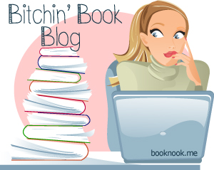
<img src="https://www.nosegraze.com/wp-content/uploads/2012/05/bitchin-book-blog.jpg" alt="Bitchin' Book Blog" />
The first part of the code contains the direct URL to our image. Next we have alt=”Bitchin’ Book Blog” — what does this mean? “Alt” stands for “Alternate;” it is the text that will appear if the image is unable to be displayed. It is always good practice to include alternate text! It’s basically just a caption of your image or brief description of what the image is. So in my case, I put “Bitchin’ Book Blog” since the image is the graphic I use for my Bitchin’ Book Blog category.
Part 2 — Styling Markup
Styling markup is basically changing the appearance of tags. You can increase font size, change colours, add borders, and more!
Float
Float is used to align an image to a certain part of the page (the left or right) and then have your other elements wrap around it. The most common example is having text (often a quote, like a book summary) wrap around an image like this:

In a future world, Vampires reign. Humans are blood cattle. And one girl will search for the key to save humanity.
Allison Sekemoto survives in the Fringe, the outermost circle of a vampire city. By day, she and her crew scavenge for food. By night, any one of them could be eaten.
Some days, all that drives Allie is her hatred of them. The vampires who keep humans as blood cattle. Until the night Allie herself is attacked—and given the ultimate choice. Die? or become one of the monsters.
Faced with her own mortality, Allie becomes what she despises most. To survive, she must learn the rules of being immortal, including the most important: go long enough without human blood, and you will go mad.
Then Allie is forced to flee into the unknown, outside her city walls. There she joins a ragged band of humans who are seeking a legend—a possible cure to the disease that killed off most of humankind and created the rabids, the mindless creatures who threaten humans and vampires alike.
But it isn’t easy to pass for human. Especially not around Zeke, who might see past the monster inside her. And Allie soon must decide what—and who—is worth dying for.
Without the float, the text would just appear to the side of the image (or below it), without wrapping around it. Here’s how you can add the “float” style. It can be applied to anything, including paragraph tags and images. In this example, I apply it to an image:
<p><img src="https://www.nosegraze.com/wp-content/uploads/2012/06/immortal-rules-julie-kagawa.jpg" alt="The Immortal Rules by Julie Kagawa" style="float:left;" /></p>
<blockquote>The plot summary would then go here, and wrap around the image!</blockquote>
The important thing to notice is this part:
style="float:left;"
As I said, this can also be applied to paragraph tags, like so:
<p style="float:left;">Paragraph text here.</p>
And of course, you can change the float from “left” to “right” if you would prefer the image to appear on the right-hand side.
Padding & Margins
Now maybe you noticed something in the previous example.. the text goes right up to the image. Wouldn’t it look better if there was a bit of space between them? Like this:

In a future world, Vampires reign. Humans are blood cattle. And one girl will search for the key to save humanity.
Allison Sekemoto survives in the Fringe, the outermost circle of a vampire city. By day, she and her crew scavenge for food. By night, any one of them could be eaten.
Some days, all that drives Allie is her hatred of them. The vampires who keep humans as blood cattle. Until the night Allie herself is attacked—and given the ultimate choice. Die? or become one of the monsters.
Faced with her own mortality, Allie becomes what she despises most. To survive, she must learn the rules of being immortal, including the most important: go long enough without human blood, and you will go mad.
Then Allie is forced to flee into the unknown, outside her city walls. There she joins a ragged band of humans who are seeking a legend—a possible cure to the disease that killed off most of humankind and created the rabids, the mindless creatures who threaten humans and vampires alike.
But it isn’t easy to pass for human. Especially not around Zeke, who might see past the monster inside her. And Allie soon must decide what—and who—is worth dying for.
In this example, everything is the same as before except I added a margin to the image to add extra space around it. Here’s what the code looks like now:
<p><img src="https://www.nosegraze.com/wp-content/uploads/2012/06/immortal-rules-julie-kagawa.jpg" alt="The Immortal Rules by Julie Kagawa" style="float:left; margin-right:15px;" /></p>
<blockquote>Text to wrap around goes here.</blockquote>
Notice how I added this into the “style” section:
margin-right:15px;
You can increase or decrease this number, depending on how much extra space you want to add.
Margin and padding are really similar, it can be easy to confuse them. In overall terms, they both add extra space around an element like an image. But let me use an example to help explain the differences.
Say you have three sheets of paper that you want to line up. Each sheet of paper has text written on it. But the text isn’t printed right up to the very edges of the paper. There is about an inch of blank space all around the paper so that the text doesn’t go to the very edge. This is called padding. Padding adds extra space between whatever the main element is (like text) and the outer edge of it (like the paragraph tags).
Now, let’s think about the three sheets of paper. We want to line them up in a row, but we don’t want them to be touching. We want space in between each of these elements. So we’ll add two inches of space in between each piece of paper as we line them up. This is called a margin. Margins add extra space outside the borders of an element.
So basically it comes down to space inside versus space outside. But for most things, padding and margins will achieve the same results.
Text Alignment
Sometimes we want to spice things up a bit and not always go for a left text alignment. Maybe you want centered text or right aligned text. We can do that!
This is an example of centered text
<h5 style="text-align:center;">This is an example of centered text</h5>
This code can be applied to almost anything, including paragraph tags! Like this:
<p style="text-align:center;">This is an example of centered text</p>
Now how about right aligned text?
This is an example of right aligned text
<h5 style="text-align:right;">This is an example of right aligned text</h5>
Just change the text-align to “right!” Easy!
Text Colour
It’s best to avoid changing the text colour too much, but for things like headings it can be very useful!
Now, when using colours, you can use a few simple names like “red,” “black,” “white,” etc. But the best way is to use hex values. This can easily be done in a program like Photoshop, or you can use an online Colour Picker. Simply select your colour, then copy the hex (#) value at the top (if using the colour picker I linked to). It will be six characters comprised of numbers and/or letters.
Now let’s see it in action!
Check out this pink text!
<p style="color:#E01B6A;">Check out this pink text!</p>
Once again we’re using “style” and inside it, we have an attribute for “colour.” Then I’ve pasted in the hex value with a leading “#” sign. Alternatively you could do something like this:
Check out this pink text!
<p style="color:pink;">Check out this pink text!</p>
The main problem with that is that the colours are limited and you won’t know exactly what shade you’ll get. It’s always best to get your own using a colour picker!
Borders
There are many ways to work with borders and several options to choose from! First, here’s what a border will look like:
There is a border around this text.
As I said, there are many ways to do this. First, when making a border there are three things you have to think about: how big you want the border to be, what style you want to use, and what colour you want it to be. So the ‘long’ way to use this in styling is to do this:
border-width:1px;
border-style:solid;
border-color:black;
But really, the better (and more compact) way to do it is to use shorthand:
border:1px solid black;
This combines everything into one nice line! Now again, we have more options here. You can increase the size if you want a larger border. You can also change the style. Here are some options:
Solid
<p style="border:1px solid black;">Solid</p>
Dotted
<p style="border:1px dotted black;">Dotted</p>
Dashed
<p style="border:1px dashed black;">Dashed</p>
Double
<p style="border:3px double black;">Double</p>
Now if you want, you can even specify different borders for different sides. For example:
Check out this crazy border!
<p style="padding:10px; border-top:1px solid #80b041; border-left:2px dotted #5d820a; border-right:2px dashed #E01B6A; border-bottom:3px double #000000;">Check out this crazy border!</p>
Crazy borders like this don’t exactly look good, but if you keep the same style and only change the colours, sometimes you can get nice results
But notice how I also added a padding of 10 pixels. Borders usually look better if there’s a bit of padding between them and the text!
Part 3 — Putting It All Together
Now let’s put together everything we’ve learned to make something super awesome!
Now here’s the code!
<div style="border:2px dashed #398d5f; padding:15px; overflow:hidden; background-image:url('https://www.nosegraze.com/wp-content/themes/summerwatercolour/graphics/bg-post.jpg'); background-repeat:repeat-x; margin:20px 0;">

<h1 style="text-align:center; font-size:30px; margin-bottom:10px; margin-top:3px; color:#398d5f;">Welcome to booknook!</h1>

<div style="float:left; -moz-box-sizing:border-box; -webkit-box-sizing:border-box; box-sizing:border-box; padding:15px 15px 15px 0; width:50%">
<h2 style="text-align:center; font-size:24px; margin-bottom:4px; margin-top:0; color:#80B76B;">Book Reviews!</h2>
<p><img src="https://www.nosegraze.com/wp-content/uploads/2012/06/eve-and-adam-showcase.jpg" width="100" style="float:left; margin-right:5px;" alt="Eve and Adam" /></p>
<blockquote style="max-width:75%; margin: 20px auto; padding: 8px 25px; background-color:#e9f7d1; background-image:url('https://www.nosegraze.com/wp-content/themes/summerwatercolour/graphics/bg-blockquote.jpg'); background-position:center top; background-repeat:repeat-x; -webkit-border-radius:20px; -moz-border-radius:20px; border-radius:20px; border:2px dotted #f3d899;">My passion has always been reading and now I have a place to share my thoughts about the books I read!  I give you: booknook!</blockquote>

<div style="clear:both;"></div>

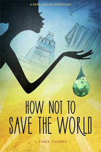
<p><img src="https://www.nosegraze.com/wp-content/uploads/2012/05/how-not-to-save-the-world-jessica-thomas.jpg" width="100" style="float:right; margin-left:5px;" alt="How Not to Save the World" /></p>
<blockquote style="max-width:75%; margin: 20px auto; padding: 8px 25px; background-color:#e9f7d1; background-image:url('https://www.nosegraze.com/wp-content/themes/summerwatercolour/graphics/bg-blockquote.jpg'); background-position:center top; background-repeat:repeat-x; -webkit-border-radius:20px; -moz-border-radius:20px; border-radius:20px; border:2px dotted #f3d899;">All of my book reviews will contain a summary about the book, a few paragraphs illustrating my thoughts, and a rating out of five stars.</blockquote>
</div>

<div style="float:left; -moz-box-sizing:border-box; -webkit-box-sizing:border-box; box-sizing:border-box; border-left:1px dotted #C4C4C4; padding:15px 0 15px 15px; width:50%">
<h2 style="text-align:center; font-size:24px; margin-bottom:4px; margin-top:0; color:#80B76B;">The Collector's Shelf</h2>
<p>I must confess: I have an addiction to collecting books... but not just any books.  I love signed books, hardcover books, old books, and first edition books!  Hello pretties, goodbye bank account!<p>

<p>Let's check out some of my lovelies:</p>

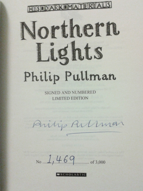
<div style="float:left; margin-right:5px; width:32%; text-align:center;"><a href="https://www.nosegraze.com/wp-content/uploads/2012/05/northern-lights-limited-edition-signed.jpg"><img src="https://www.nosegraze.com/wp-content/uploads/2012/05/northern-lights-limited-edition-signed.jpg" width="100" alt="Northern Lights - Signed" /></a> <br />
<span style="font-size:12px; font-style:italic; color:#66625e;">Northern Lights - Signed Limited Edition</span></div>

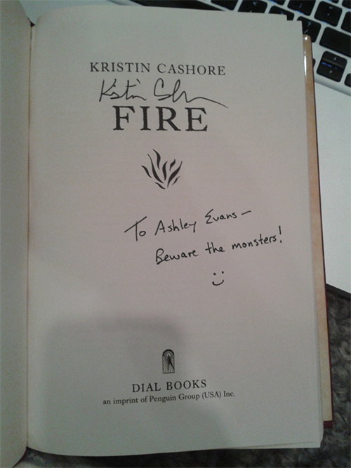
<div style="float:left; margin-right:5px; width:32%; text-align:center;"><a href="https://www.nosegraze.com/wp-content/uploads/2012/04/collection-fire-signed.jpg"><img src="https://www.nosegraze.com/wp-content/uploads/2012/04/collection-fire-signed.jpg" width="100" alt="Fire - Signed" /></a> <br />
<span style="font-size:12px; font-style:italic; color:#66625e;">Fire - Signed</span></div>

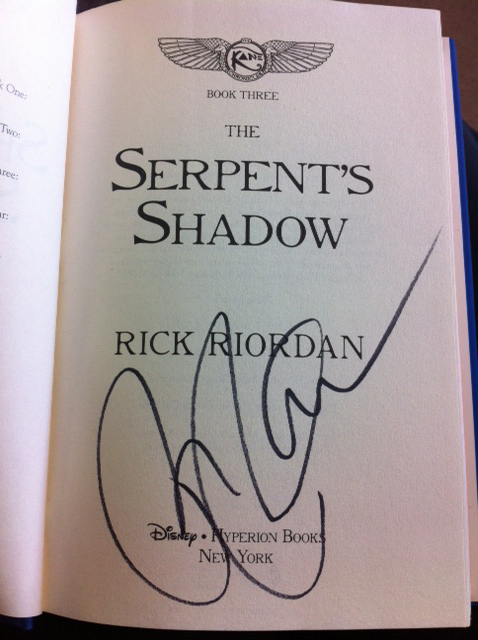
<div style="float:right; margin-right:5px; width:32%; text-align:center;"><a href="https://www.nosegraze.com/wp-content/uploads/2012/05/serpents-shadow-signed.jpg"><img src="https://www.nosegraze.com/wp-content/uploads/2012/05/serpents-shadow-signed.jpg" width="100" alt="The Serpent's Shadow - Signed" /></a> <br />
<span style="font-size:12px; font-style:italic; color:#66625e;">The Serpent's Shadow - Signed</span></div>

</div>

</div>
Okay that might be a little… daunting. But honestly it’s just something you get used to with time. When I first got into HTML and CSS I was terrified at the idea of constructing my own code. I could edit existing code okay, but I just couldn’t wrap my head around how you could just make your own. Now, with many years of practice, it’s practically second nature for me!
Important Note
One thing that’s important to realize is that everything I’ve gone over in sections 2 and 3 is inline CSS, which is styling inside the markup. When making an entire website, this is bad practice. I’m just teaching it here for ease of use. The best way to construct a website is to create an external stylesheet and move all your styling into that CSS document. Then, rather than doing something like this:
<blockquote style="max-width:75%; margin: 20px auto; padding: 8px 25px; background-color:#e9f7d1; background-image:url('https://www.nosegraze.com/wp-content/themes/summerwatercolour/graphics/bg-blockquote.jpg'); background-position:center top; background-repeat:repeat-x; -webkit-border-radius:20px; -moz-border-radius:20px; border-radius:20px; border:2px dotted #f3d899;">Blockquote text here</blockquote>
You’d move all the styles into a stylesheet, which would look like this:
blockquote {
	max-width:75%;
	margin: 20px auto;
	padding: 8px 25px;
	background-color:#e9f7d1;
	background-image:url('https://www.nosegraze.com/wp-content/themes/summerwatercolour/graphics/bg-blockquote.jpg');
	background-position:center top;
	background-repeat:repeat-x;
	-webkit-border-radius:20px;
	-moz-border-radius:20px;
	border-radius:20px;
	border:2px dotted #f3d899;
}
Then in the HTML you could just type this and all the styles would be applied:
<blockquote>Blockquote text here.</blockquote>
That’s so much easier than writing out the styles each time!
Maybe in a future tutorial I’ll go over CSS a bit more. 
Useful Resources
Here are some external resources that can help you with more HTML and CSS:
- W3Schools — Excellent resource for HTML, CSS, and other coding languages!
- Markup Validation Service — Paste your code into here and it will tell you if you’ve made any errors (like if you forgot your closing tags).


Great tut Ashley! I remember struggling to find information like this when I first started using html (let alone php) but was lucky to have a good friend point me in the right direction. It’s so easy now after all the practise, but it seemed so daunting at first.
Thank you so much for this, Ashley! I checked out some of the links above and they’re really helping. Everything is so much clearer now
You’re so welcome!
Hi Ashley!
Thank you for this useful tutorial and references!
I would like to learn how to design my own theme (would that be the easiest to learn?). Aside from HTML and CSS, what other coding languages would I need to know? Should I have a good grasp of Photoshop as well? Is it possible to self-learn?
Hi Jessica
If you want to design your own WordPress theme from scratch, then you’ll need the following:
1. A self-hosted WordPress site. You can’t upload custom themes to the free WordPress.com.
2. Knowledge of HTML, CSS, and PHP.
3. You’ll have to spend a lot of time reading the WordPress codex.
4. Photoshop would be helpful for creating graphics.
I do offer an e-course on how to make your own WordPress theme if you’re interested. It’s not currently open for registration, but it will open up again in a month or two.