As most of you know, I’ve been partnering up with Anna Moore for a few months now to create website for clients. She handles the design and I handle the coding. Well, today I’m going to tell you all about our latest project: building Jessica Sorensen’s website.
Anna really challenged me with this design. It has some pretty crazy angles and triangles that were SUPER CRAZY to figure out in pure CSS. But I did it and it’s awesome!
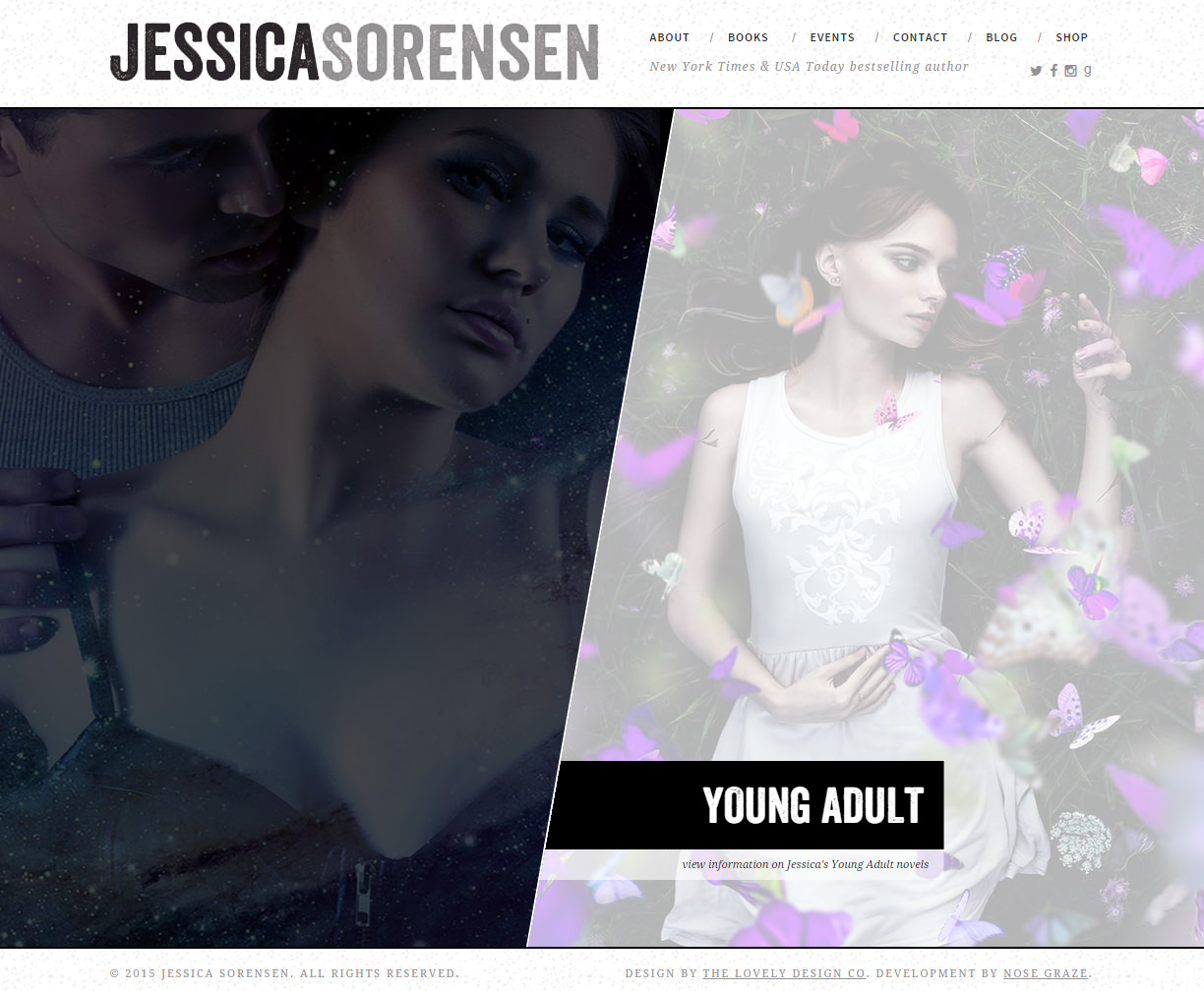
A split homepage
You can see the beautiful homepage pictured above. It has a split layout with an angled divider down the middle. That angle was actually a lot more challenging than you’d think. The problem is that there isn’t a way to angle only one side of a div in CSS. You can skew both sides, but not only one. So what this actually involved was:
- Skewing both sides of the container on each side (left and right).
- Skewing the actual images in the other direction so that the images themselves weren’t angled.
- Enlarging the containers so that the skewed outer edges weren’t shown.
- Hiding the overflow so that the inner images fit inside their containers.
This page alone took me a few hours to figure out, but once I got it working I was able to apply the same logic to other areas of the site.
Individual pages have crazy triangles!
At this point I’m thinking, “Oh Anna, what have you done?”
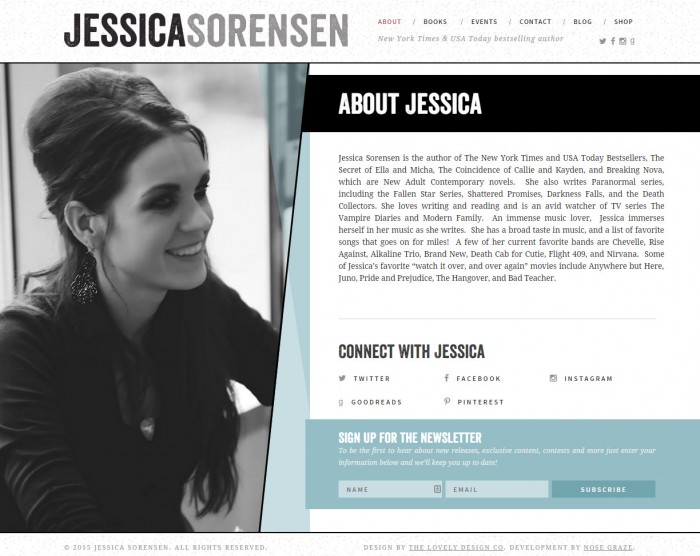
Here we have a split screen, with a full width image on the left and text on the right. But LOOK AT THOSE TRIANGLES!!
- There’s an angled black dividing line that kind of looks like a border.
- There’s a solid, light blue right triangle. It basically fills up all the space to the right of that black border.
- There’s a darker right triangle that’s flipped vertically from the light blue one. But this one is slightly transparent and it doesn’t reach the bottom of the page. It’s a big shorter. And, it also needs to be underneath the black line, but on top of the light blue triangle.
- Then we have an angled “About Jessica” part at the top. It’s angled on the left side to match up with the black divider line.
Let me tell you: it was ridiculously challenging to get all of these layers in order. First I had to figure out CSS triangles. And actually, CSS triangles are quite easy using borders, but the problem with that is you can’t use percentages. You have to use fixed values for borders (like 20px or 500px). And that wasn’t going to work with me when I was dealing with dynamic heights because you don’t know how tall that area is, since it depends on how much content is on the right.
A unique blog layout
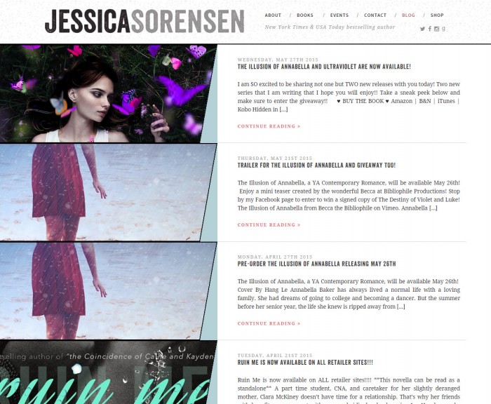
Luckily, the blog was quite easy to put together since it was the very last thing I created. At that point, I had the whole “angled on one side” images thing NAILED.
But the blog was unique because the posts are actually loaded with ajax. Then it does this cool thing where when you click on a post, all of the thumbnails fade out except the one for the post you clicked on. Snazzy!
Integrated with the Novelist plugin
Jessica’s whole website is seamlessly integrated with the Novelist plugin, which is a plugin that helps authors manage their websites and book pages.
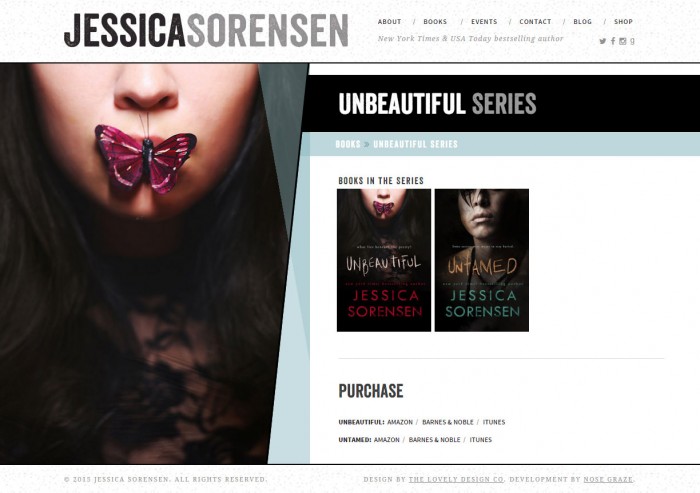
Here’s an example of what a book’s series page looks like. This one is for the Unbeautiful series:
Each page has a full width picture of the book/series on the left, with the books on the right.
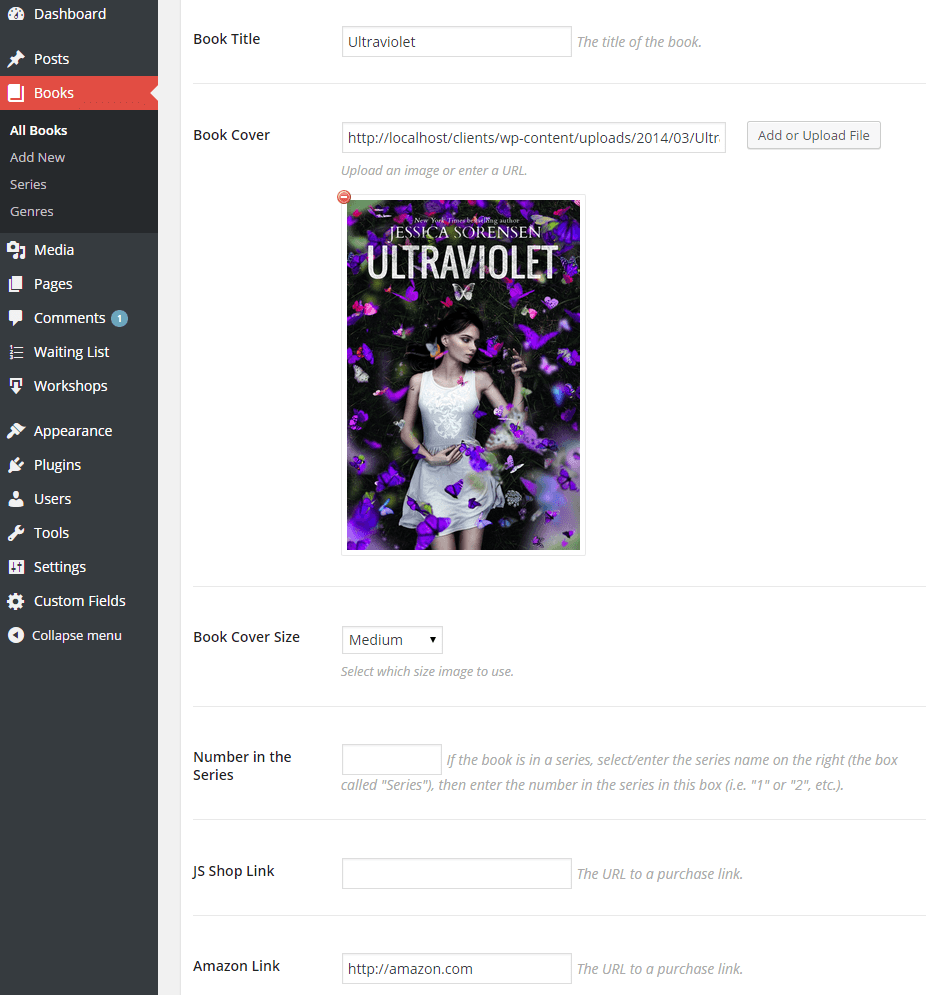
This page is pretty much automatically generated. All Jessica has to do is create a page for each book and fill out user-friendly boxes for the book title, series name, purchase links, etc. Then this page gets created automatically with the covers of each book in the series (each one linking to the individual book) and the purchase links are automatically put together at the bottom.
Then of course each book has individual pages too that list the synopsis, etc.
WooCommerce integration
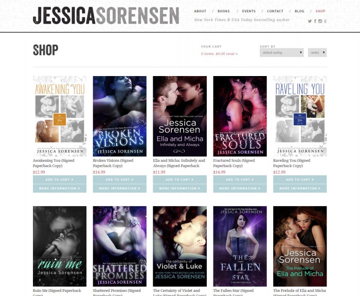
Jessica had been using WooCommerce to sell her books online, so this integration was a must in her new theme. I did a lot to customize the WooCommerce page templates, including adding the cart to the header area (next to “Sort By”).
The most challenging design I’ve done… until maybe Anna’s website
At the time, Jessica Sorensen’s website was easily the most challenging site I’d ever built, due to the unique angled/triangle design elements. However, after finishing Jessica’s site I started coding Anna’s new site (coming soon!), which might have even more crazy angles! Anna sure likes to keep me on my toes.

I’ve made it one of my life-goals to get one of your blog designs for my blog. Maybe when I win the lottery. *sob*
Anna and I have talked about giving away a free design or at least a discount at one point. But we haven’t had time to do it yet because we’ve been so busy! Maybe in the next few months. 🙂
I LOVE IT! HER BLOG IS AMAZING! Kudos to the both of you! <3
Thank you Angela! 🙂
I LOVE this design. I’m currently writing a YA novel, but have written some non-fiction as well. The split design would work well for anyone writing in different genres.
Yeah it works super well! Huge props to Anna for coming up with that great look. 🙂
Best of luck with your novel Elissa! 🙂
Wow. It looks amazing! You guys are awesome.
Thank you Liezel. 🙂
It looks amazing! I never would have guessed it would have been so troublesome to code though. You two continuously amaze me with your themes.
Triangles and angles are always a bit tough, but the way Anna did them made them even tougher! Haha!
We have some pretty awesome new pre-made themes coming soon. 🙂
I am incapable of expressing just how much I LOVE this design. Gorgeous and unique, only to begin.
Ashley, I am in awe of your coding skills. You’re a damn superhero! Lol.
Thank you so much Dani! I love it too! I was totally floored when Anna sent me the mockup.
It looks amazing!
Thanks Angel! Anna did one heck of a job with that design. 🙂
Is this the same Anna Moore that ripped a load of people off!??
Sadly yes it is. That was several years ago now and in a dark part of Anna’s life, where she made many mistakes. She didn’t “rip them off” out of malice, but because she was going through a tough/dark time emotionally and her business (and thus her clients too) suffered because of it. That doesn’t make what happened okay by any means, but it makes me personally feel better about Anna as a person.
I knew of her before and when this happened, but only came to know her closely and personally afterwards. At first, I looked on her with mistrust, like most other people in our community. But I came to start talking to her and eventually be friends/business partners with her almost by accident. I guess it was hard for us to avoid each other when we work in the same industry and community.
As I got to know her and realize she wasn’t a bad person, I sort of lost my grudge against her and decided to give her another chance. I knew that bad part of her life was well behind her and she’d done her best to make it right with those clients. And now we’ve been doing business together for over six months and have completed almost 13 awesome projects together in that time.
I’m not saying that you have to forgive her or like her or even “let it go”. I wouldn’t presume to tell someone how to feel about or react to something like this. I know we all handle things like this in different ways. In fact, I’m usually a massive grudge holder myself, so I don’t know what made this situation different for me. All I hope is that while you’re here you’ll be respectful, and maaaybe even try to understand why I feel the way I do, even if you feel differently. 🙂
Her website is amazing. Very nice work on your part! 🙂
@dino0726 from
FictionZeal – Impartial, Straighforward Fiction Book Reviews
Thanks Diane! 🙂 I’m so glad you love it!
I said it on Twitter and I’ll say it again. The website looks fantastic. I played around on it a little yesterday after Anna posted a link to her post.
Thanks Laura! Anna constantly amazes me with the designs she comes up with.
Thank you all so much 🙂 It was such a pleasure to work on the site with Jessica and to get to see Ashley fiercely stab all of the CSS to death with her magic coding skills (for real, I think she’s a wizard. A Coding Wizard Ninja, to be exact!) 😀 And of course, it was fun to work on it with Ashley too, she constantly amazes me at what she can do, truly honored 🙂
SO BEAUTIFUL…i need money now to have a site like that XD…it will take time but wait for me ashley and anna one day i will be a client, love the work you both do
Thanks for your kind words Vera. 🙂
Wow, you guys work well together. I think if you guy keep up this style of blog creations Ill have to buy one. Im in love with what you did for Jessica Sorensen! 🙂
Super slick.