I have come across a lot of blogs that have a graphical background image that doesn’t repeat and doesn’t fill the whole page. Often times these people pick a background image that looks perfectly fine on their computer, but on a larger screen it’s obvious that the image doesn’t fill the whole page. It can make the layout look a little unattractive!
So today I’m going to teach you how to make your background image fill the whole page, regardless of the size of the screen!
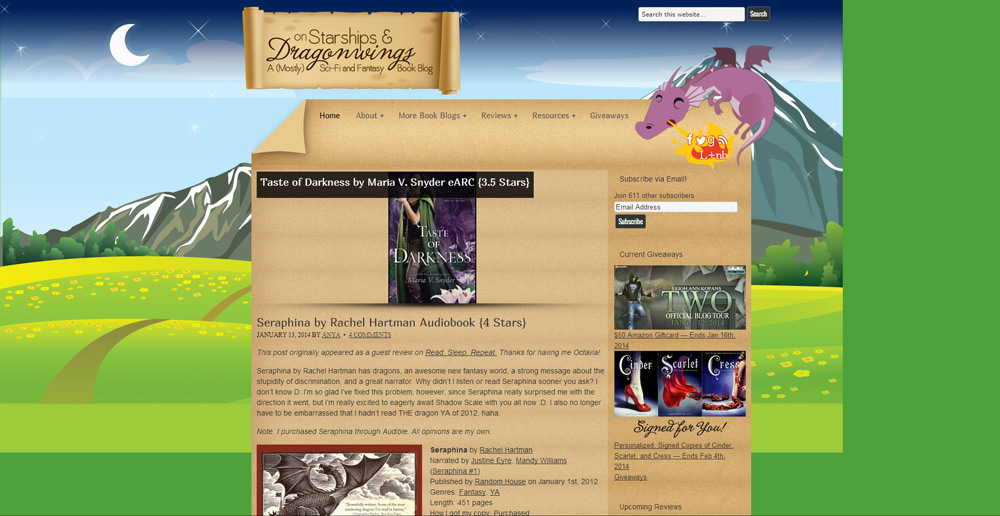
Before
See how the background just ends? And then it turns into the background colour, which is green. This abrupt cut-off can make your blog look unattractive and less professional.
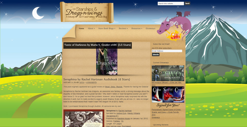
After
This time the image fills the ENTIRE screen! It looks so much better!! This is clearly how the page was meant to look.
How it’s done
This is actually EXTREMELY easy to do! All you need is to add a bit of CSS to your blog like this:
body {
background-size: cover;
}
* This bit of code is supported in all modern browsers. It may not work in older versions (particularly IE8 and below).
It’s like magic!
Be sure to pass this onto your friends or any blogs who don’t have a background image that fills the whole page! It’s a super easy fix and I want everyone to have beautiful background images, regardless of monitor sizes!
** Huge thanks to Anya at On Starships and Dragon Wings for letting me show her before and after pics! **


Never knew it was that easy! Thanks for sharing!
My background is already good as far as I know. But I imagine this will be really helpful for others!
I’m using a 27′ iMac, and if I blow up my browser (Chrome) full screen, your background cuts out and there’s a white column on either side of my screen. But I’m probably the exception, moreso than the rule. Figured I’d give you the heads up, since you thought you were in the clear!
Really? Thanks! I’ll add the code!
Really? Thanks! I added the code, is it better now? =)
I never knew it was that easy! I don’t know for sure if my background image is large enough for all monitor sizes so I’m definitely going to add that code to be sure. Thanks for sharing!
LOL, that is easy!!!
I’m taking a web design elective this year and it really hasn’t done much for me in terms of my knowledge of code and stuff but whenever I’m using Dreamweaver to do the websites sometimes the background just stops after a certain point because I didn’t set it on repeat (and it annoys the ever loving crap out of me) so thanks for showing me how to fix that, Ashley! <33
<33
If you have one big image (like in the example) then it’s a lot better to use this method than just setting it on repeat anyway! Because images like that one aren’t meant to repeat so you’d very obviously see the “seams”, which is just as unattractive!
So if you have a background that’s repeatable (like my background with the shapes), then set it on repeat.
If you have one big image like Anya does in the example, then use the “cover” bit of CSS!
Omg I’ve been searching for this for such a long time! Thanks for sharing, Ashley
Is it possible to use this method for other elements as well, like a navigation bar? Or a header/footer?
Absolutely! You just have to target a different element. So you have to figure out what class or ID your header/footer has and use that. Example:
That would target an element with the ID “footer”.
THANK YOUUU! I’ve had this problem for so long that I started using images that were easy to repeat just so that I *could* repeat them since they never filled the screen. And since getting a desktop, I realize that not everything that looked good on my laptop looked the same to others. Sweet relief haha. :]
Testimonial: It was crazy easy to fix! Thank you again so much Ashley!!!
Totally going to do this.. I’m not a fan of backgrounds that are tiled
Sorry for being ignorant. Where do I put that piece of code. In the Cpanel?
Not in cPanel. You have to put it in your site’s code files. If you’re using WordPress, install Jetpack and enable the Custom CSS feature. Then put the bit of code there.
Thank you!!! This has been driving me crazy and now it’s fixed!
Thanks Ashley, very helpful. It seems to work great on my PC (I don’t tile and don’t scroll with page), but my IPAD blows the image up to the full length of the blog, so it looks pixellated. Any suggestions? Regards, Mike
The “cover” background-size option is defined like this:
So the desired effect is to have the whole background area covered by the background image (both width and height-wise).
If you don’t want that, you could try
background-size: contain;instead, which is defined as:So it won’t necessarily fill the whole page, it will just fill it so that both the width and height can bit, but not necessarily both of them fill the whole area.
Thank you Ashley. I’ll try that.
Hi! Im working at my blogspot blog and i don´t know how to put this code in my html template
¿Where i need to put this?
Thanks very much!
If you go to customize your template, there should be an option somewhere (maybe in the “Advanced” section?) for custom CSS.
Sorry I can’t be more specific; I don’t use Blogspot.
it works, but the code doesn’t keep the picture proportionality scale to the screen
The picture will always be proportionally scaled to its original size. So the picture itself won’t stretch. But the goal is to have every inch of the background covered, so that means parts of the picture may be cut off. That’s better than having the picture stretched/distorted to fit the screen size.
JESUS THANK YOU SOOOOOOOO MUCH
You’re so welcome!!
Hi, thank you for the post. Unfortunately, I am running into this problem here: http://www.dutyfreecritic.com/ask, however when I looked at the code I actually already had the code you spoke about. Am I going about this wrong? Do i have a different problem?
The image is full screen for me. If you’re not seeing the changes then maybe your browser has cached how it was before and you need to do a few refreshes.
Actually, maybe I’m not explaining well. I mean that light off-white background is cutting off randomly.. I’m not talking about the picture of my face lol.
Sorry but that doesn’t really have anything to do with a full width background image.
Ah I see. I was considering that a background image. I guess that’s the issue I must be running into then when I’m looking at my code. What you would consider the off white part then? Is that a body image?
You have that section of the content set to off white in your code.
Sadly this goes outside of the scope of free help I can offer since it doesn’t have anything to do with this blog post.
Ah, ok well thanks though! I appreciate you responding.
YOU ARE MAGIC!!!
Thank you for sharing and made it some simple. I had spent several hours trying figure it .
Hello
I am starting to build up my own blog and using a bought DIVI theme .. just like you I guess..
I really like the feature you made where you have framed your general text, like it was written on a piece of paper.
my question is: How did you frame your text? I would like to do it on my block as well, however not as written on paper but on a block of wood instead.
I don’t use Divi – sorry.
thank you very much its work 100%
Hi,
I use your recomendation to fill my entire page with my uploadet photo,but the prblem is i still have black boarder line at the bottom of the page then i scroll,is it bicouse i dont tile picture or something else,or is not posiblle to have endlles photo picture then scrolling?does it have to be some pattern only picture? Please help,thank you.
Jonas
Thank You so much.