As probably all of you know, I’m a web designer. Today I’m going to share with you some of my old website designs, which are total crap! I got this idea from Rinn Reads, who shared some of her own old site designs!
My first experience with web design was with Neopets. I used to play when I was like 12 and I’d design/code my user profile and create mini web pages for my Neopets.
Neopets Designs
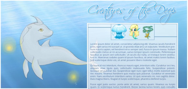
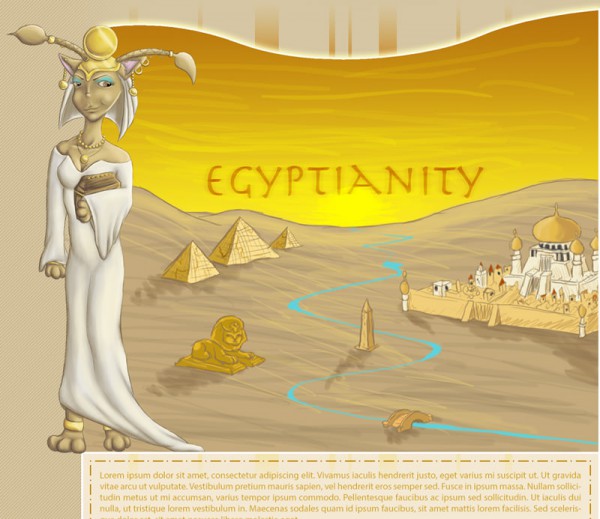
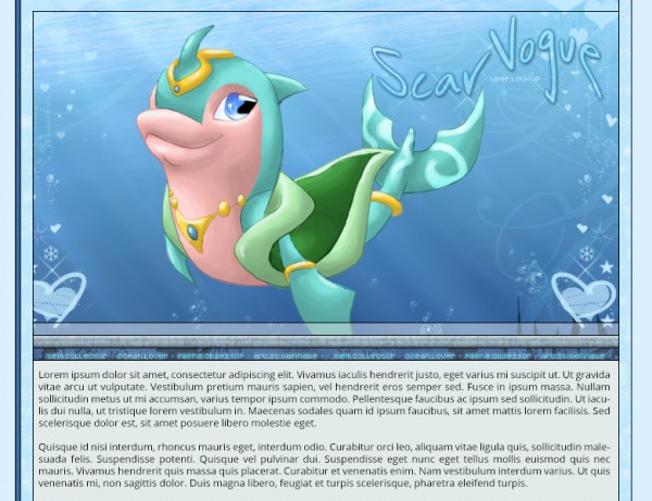
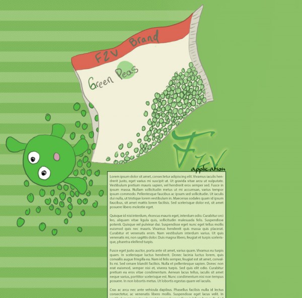
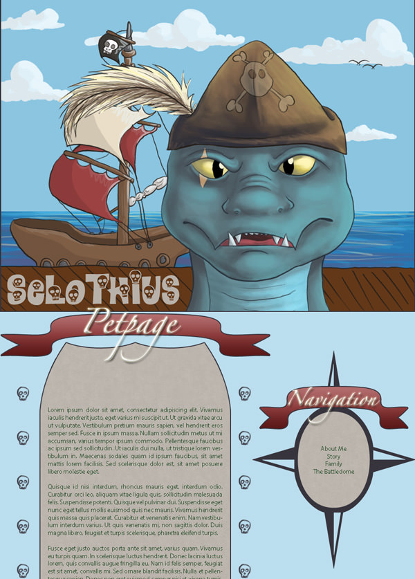
I’m not going to talk about these individually, because they’re all so similar! At this point I sucked at coding. Basically all I did was draw a header image and then pick one spot to put text. Then I’d absolutely position the text box there.. and that’s it!
Also you can see some of my silly Neopets artwork—hah!
Portfolio Website Designs
Now, what you see below is after my intro Neopets stage, when I first started designing my own portfolio site (previously called Ævans Arts, now called Creative Whim).
Mmost of these are really ugly, but you can see how I progressed, which is pretty cool!
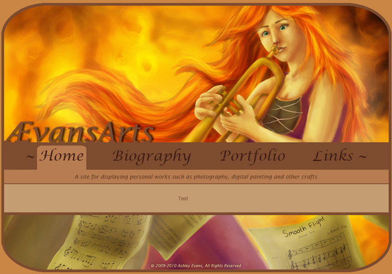
Ævans Arts #1
This was one of the first designs where I incorporated one of my artwork pieces into the site. It’s a very graphical layout and the text would go where you see the “Test” text. I’m actually not sure if this was my first ever Ævans Arts website design.. I feel like maybe it was my second. But it was the earliest one I could find!
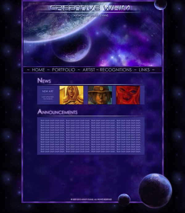
Ævans Arts #2
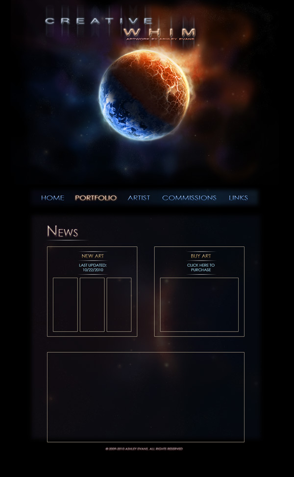
This is when I first started toying with the idea of using the name Creative Whim instead of Ævans Arts. The domain name was still aevansarts.com, but I started using Creative Whim in the header. I was really into space art at the time so I turned that into a layout. Again, a very, very graphic-intensive layout. And I was really into glowing text and lines.
Ævans Arts #3
Yet another space layout, but a lot more simple than the previous one. God the typeface in the header looks awful. Since this is a mockup the boxes are empty, but that’s basically where images/text would go.
Ævans Arts #4
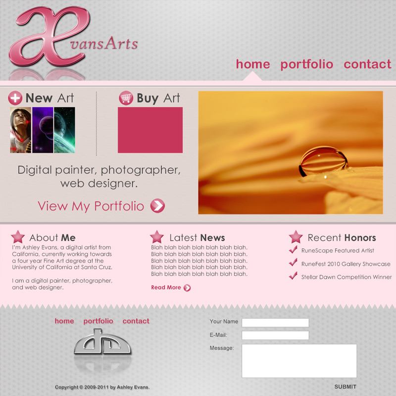
This was my first attempt at a more ‘modern’ layout. The others were super graphic heavy and with this one I tried to be more simplistic and focus on design rather than incorporating my own artwork. i was actually happy with this for a long time, but the coding was a bit sucky.
Creative Whim #1
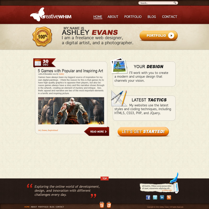
This is when I officially moved my site from aevansarts.com to creativewhim.com! The layout was very, very different from what I’d previously done, but I was happy with it and felt like I was finally progressing as a designer.
Creative Whim #2
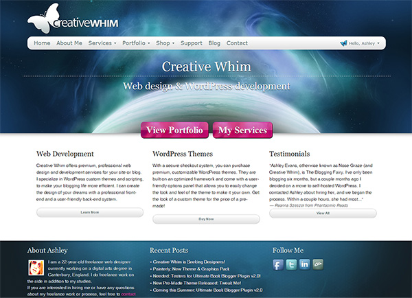
This was a massive overhaul! I went back to space art, but did a bunch better job incorporating it into the design than before. This was also one of my very first websites that was responsive. I ended up keeping this layout for a long time!
Creative Whim #3
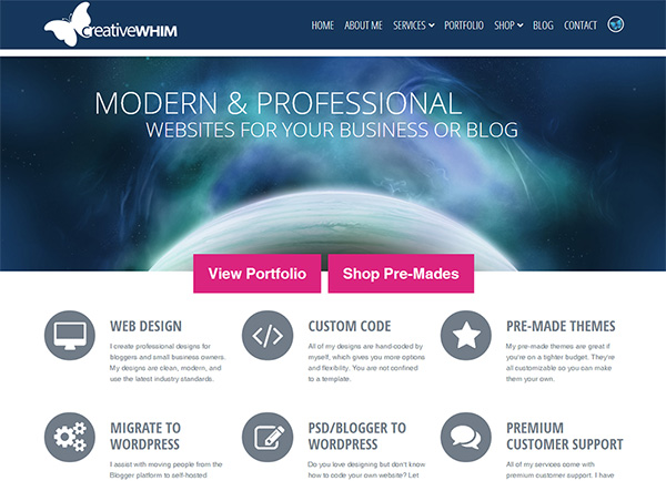
This was just a small touch up on the previous design. I still loved a lot of the aspects, but I felt like some of it was a bit dated. I wanted to keep the space theme but try a more modern, “flat” UI style. And this is what Creative Whim looks like today!
How far I’ve come!
It’s so cool to look back and see how far I’ve come as a designer. That first Ævans Arts design was from 2010, I think, so I’ve grown a lot in just four years! I hope that in another four years I’ll look back on my current work from 2013/2014 and think, “Wow, I sucked back then!” 
I just hope I continue to get better and better!

Well, I think they were all awesome. But I do see a huge improvement as you got more experience. That was fun!
Thanks!
Hahaha, I tooooootally started web design at Neopets as well. And agreed, it was all about making a header and then sticking one text box somewhere hahaha. Nice to see that we have that in common
I love seeing this post! I wish I kept some of the old designs I made, but I tend to delete them out of shame when I finally make something better lol.
Haha, high five for Neopets! Good times, good times.
Awww you totally should have kept your old designs! I’m such a digital packrat. I have about 4 terabytes (yes, TERABYTES) of files on my computer. I’ve never deleted any of my Photoshop files… ever XD
Oh gosh, crying at the peas one. That’s adorable.
Haha thank you! I loved that one too. I remember being so proud of it when I made it.
I’m dying. This is so fun. I’m so happy to see that others got their start with web design on Neopets… because I did, too! And you can see how that all panned out. I abandoned that endeavor from basically the word go.
It’s incredibly humbling to look back on your old work, no? Definitely reminds you that there is always room for improvement. BTW, you rock as a designer so don’t ever have even a shadow of a doubt.
Yaaay another Neopets girl! *high five* We should start a club.
Ooh yay, I’m glad to see your old designs, especially compared to your talent now! =D Your artwork is seriously impressive from a young age though! That second space-themed layout gives off a Mass Effect vibe. And I really love the last two Creative Whim designs (space layouts <3), they work really well without being too graphic heavy.
It's so interesting to see how people have progressed, especially you as I really admire your work & talent with design and coding =)
Thanks so much!!
You’re totally right about that Mass Effect vibe. I didn’t think of that! I’m totally into the space art. It’s so much fun.
you’ve definitely grown so much in four years, but your neopets designs are so cute! You could probably do better work than I ever could have, but I love your current design it’s so sleek and pretty <33
Lol thank you!!
This just proves that I have a lot of learning to do before I can make something even half as decent as these, lol! I really like the template (for the news section) of the third one for some reason. And the green Neopets one… cute and simple! You’ve definitely improved a lot and I hope to do the same one day. ^_^
Thanks! I’m sure you’ll get there! It just takes a lot of practice. Like, I remember in the beginning I couldn’t code worth a damn. I had to use templates that had all the code already, then I’d just modify it to change a few colours and put my own graphics in. But after enough practice, I was finally able to do everything from scratch!
Oh my goodness. Neopets! I haven’t thought about that in forever. My poor monkey is probably dead now that I have neglected her for about ten years. Whoops! I have to say though you are very clearly talented in web design. Even your beginning attempts far surpass anything I have ever tried. I’m sure you will just keep getting better and better!
Haha I bet all my pets are dead now too! XD Poor little guys!
Even your first designs look better than what I probably could create, haha. I like the Scar Vogue one. It’s clear that you have a talent for it!
Thank you!
Ahhh, I love that you’re sharing these! I used to play Neopets once upon a time, too, but surprisingly I never designed any webpages for any of mine! I’m nto sure why I didn’t, because around that time is when I used to be pretty obsessed with web design!
It is really cool to see the progression from your earliest portfolio site designs to the recent ones! I love seeing an artist grow over time,and you certainly have! It’s also fun to see these designs and remember how I was making similar ones, because that was what was “modern” at the time (especially those graphic-heavy layouts and the pink-ish one!).
Now I really want to go back and look at some of my old ones. I remember being so proud of them back then, but I wonder how awful I’d them they are now, lol!
Aww you totally should have made some petpages! It was so fun!
But yeah, those graphic intensive layouts used to be all the rage. It’s funny how web design trends change.
I love seeing your progress. Of course, since I have little artistic talent, I think they are all incredible! Keep up the good work and inspiration!
Thanks so much!
Haha! I used to play Neopets, too!
I briefly went through this stage where I spent all of my time designing profile layouts for this online game called Howrse. I’d design the layout on Gimp (basically a giant header image with the player’s name and a box for text) and slap a box with a scroll bar on it.
I never tried to expand my coding knowledge after that phase ended. I’m much more comfortable designing newspaper layouts on Adobe InDesign.
I love reading these posts! I think your ‘bad’ ones are still better than I could ever do! I’m really not a very techy person so coding would just confuse me way too much. I love the space phase (haha, it rhymes!) that you went through. The images are all so gorgeous and Creative Whim looks SO good right now!
Gonna be honest… If that first one is you “sucking” then I’m doomed for life. Those Neopet ones were pretty good. Like I know you’re so much better now and you’ve progressed, but at the same time… That was amazing!
I loved looking at these. You’re kind of hard on yourself, lol. But you’re awesome <33
Oh gosh. I don’t even want to go back and see my old designs. I keep a lot of them but some of my really really early stuff was on geocities (gasp!) And I don’t think I ever screencapped them.
Haha, I remember Geocities! Wow.. I had some weird stuff on there too!
Your ability to design websites is really awesome! Even your earliest designs are a billion times better than any site I’ve ever tried to design myself, so you need to get extra credit for that. I love the latest look of your site though — great job!
Wow! You are so talented! I would fail at making even the NeoPets ones. Lol. Thanks for sharing these!
Wow! I loved seeing your progress! It would be funny when in 4 years you think your current designs at sucky – but that’s what growth is all about. I didn’t know you did 3D art like in the Neopets site! So awesome.
Dude, all of them are still so good! But of course, they’ve improved over time. If I were to share my first blog design, THEN, you’d be laughing.
Thanks for sharing, Ashley! <33
Hahaha dude all of these are really cute! The pee one is my favorite!!! You should see MY first designs now THAT was a train-wreck!
Oh man! I remember those days and trends. I wish I had my old ones, but I started out at Geocities and then subdomains on other friends, so it’s alllllll gone.
Wow, that’s awesome! I look back at some of my first vector designs and cringe. I’ve improved a lot with GIMP over the past couple years of using it, but I still need to learn coding! I seriously love this post, it gives me hope for myself
Wow. What amazing progress, the more you learn about what you love the more you can use it to your advantage. You’ve definitely done that!