Hi!
I wonder if you have any tips for designing a long term logo for a brand? I want mine to be very personal and recognizable, but I also want it to be sustainable and versatile. And mostly I would love it to be just a font, so it is readable by google. How. Dafuq. Can I do that?! And also, do you know if there are any logo trends coming up that I can make use of?FIT by Emma Hå – http://fitbyemmaha.com
I’ll let you in on a little secret: the most timeless logos are typically the simplest ones.
In fact, “trendy” and “timeless” are practically antonyms.
Let’s talk about what I mean by “trendy”.
Have you ever seen a font get really popular really fast on Creative Market?
Odds are, it’s trendy. It comes into fashion, is hot for a few months, then suddenly EVERYONE is using it, then it falls out of fashion. If written in this font, your logo probably goes through this cycle:
- SO AWESOME!
- Looks like everyone else.
- So overdone.
People get tired of trends.
That’s the problem with trends. Something becomes cool, then EVERYONE is doing it, then people get tired of it and see it as unoriginal (because everyone has done it).
I’m hesitant to name some actual fonts because I don’t want to hurt peoples’ feelings. So first, let me be very clear…
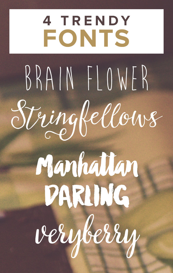
That being said, here are a few examples of fonts that have EXPLODED in popularity, created (or followed) trends, and then died out a bit:
- Subtle handwritten fonts (like Brain Flower).
- Really feminine, scripty fonts (like Stringfellows).
- Messy, thick brush fonts (like Manhattan Darling).
“But that font represents my brand PERFECTLY! Are you saying it can’t be my logo??” — Not necessarily.
I’m not saying “Don’t use these fonts.” That’s not what I’m saying at all.
I’m saying: using these fonts because they’re ‘hot’ and ‘trendy’ is a mistake if you’re looking for a timeless logo. It means you’re jumping on the bandwagon because it’s popular now.
Your logo shouldn’t be a representation of a current trend. If it is, you will get tired of it, and so will everyone else. Your logo should be a representation of YOU and YOUR BRAND.
So if a thick brush font represents your brand COMPLETELY and it totally resonates with you, your message, and the vibe for your whole blog/website/company, then go for it!! Own the mother fuck out of that font.
But if your brand was never about thick brush fonts, then you see the font and suddenly fall in love with it, don’t jump on the bandwagon. This one moment of love for a font won’t give you a timeless logo; it will give you a trendy logo that you’ll probably end up redoing in just a few months.
A timeless logo isn’t one you SUDDENLY fall in love with. It’s something that represents your whole brand and vibe so clearly.
As I said at the beginning, the most timeless logos are typically the simplest ones. More complex, stylistic designs tend to go in and out of fashion more easily, which is why they’re typically not timeless.
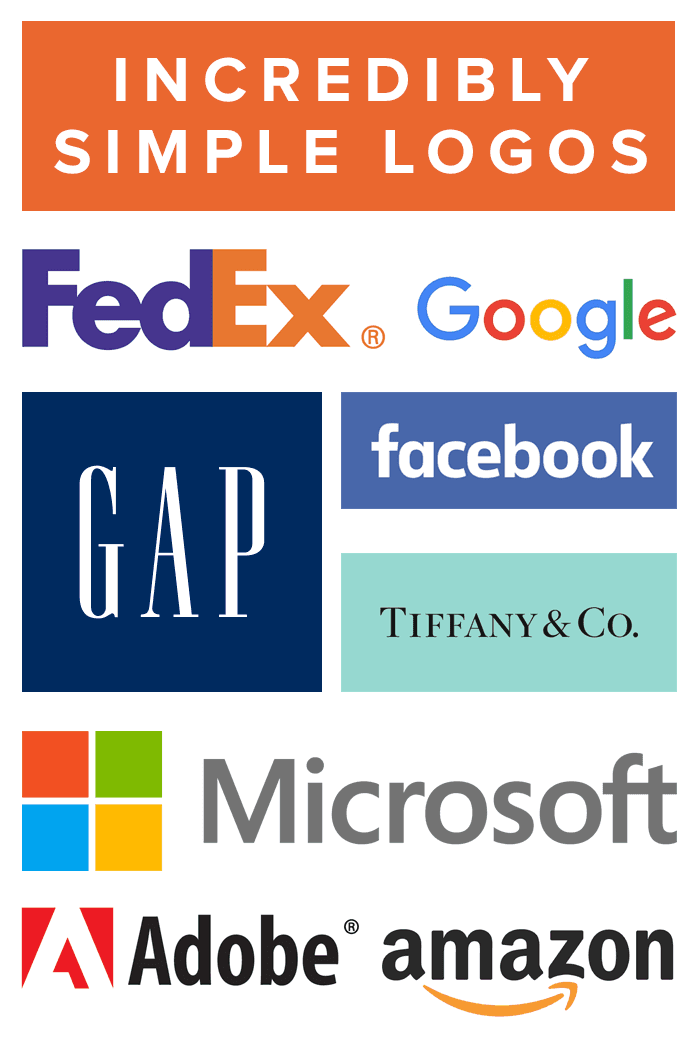
Think about all the companies you know well and imagine they’re logos. Most of them are probably going to be super simple serif or sans-serif fonts. Very few scripts, brush strokes, or handwritten letters.
Incredibly simple, famous logos.
Simplicity works. It can stand the test of time.
Most of the logos from that list that have been redone (like Microsoft) are the ones that USED to be very stylized. The ones that have stood the test of time (FedEx) were always incredibly simple.
Now and then, a company has a more complex one, but because it represents their brand completely.
As I said, that doesn’t mean you can’t have a stylized logo. It just means that you should only go that route if it 100% matches your brand, your vibe, and totally embodies your company/blog.
Here are a few examples of more stylized logos:
- Disney
- Harry Potter
- Coca Cola
How to decide what font to use…
- If you’re not looking for a timeless logo and you just want to play around with designs, use whatever you want. Follow trends, don’t follow trends, it’s totally up to you.
- If you do want a timeless logo:
- Think about YOUR BRAND. This isn’t just your design, but also your personality and vibe.
- What words do you associate with your brand? Playful? Fierce? Professional? Young? Seasoned?
- Make a list of all these words and look for similarities.
- Find fonts and styles that resonate with your chosen words.
- Don’t look at what’s hot or popular. Seriously. Don’t even look at those lists.
- Pick a style because it resonates with your brand—not because it’s popular.


I didn’t know there’s a font called lobster You’re right, Ashley. It’s overused! (I Googled it.) On another note, I rarely follow trends as I prefer things that are under the radar
Yeah Lobster is one that comes up a lot when people talk about overused fonts.
Oh my gosh, this post literally could not have come at a better time for me. I was in the process of designing a new logo today. I had designed two that I loved that I couldn’t decide between: one was very simple, matched my current branding, etc. The other was more flashy and something new for me. I thought it was beautiful, but everyone I asked recommended I go with the simpler one, which I ultimately did. But it was hard to accept that the simple, timeless one would be better for my blog and brand in the long run!
I’m sure you made a great choice Erin! Flashy can be fun, but we can also get tired of it very quickly.
Oh, how I hate Lobster! Aso: Curlz, Sofia and Scriptina. Gah! Scriptina.
I have feelings about fonts. Lol.
I also have two opinions that may get me lynched.
1) I think (unless they are done very well) while the handwritten/calligraphy logos are beautiful and artful, they’re kind of starting to run together. They’re no longer memorable.
2) The illustrations of the chipper girls with cups of coffee and their laptop? Hate those. They look terribly dated.
I’m going to go hide in my panic room now.
Ohh great list Dani! I remember when I was addicted to Scriptina. I used it for everything like 10 years ago lol.
And I agree with your two other points – kind of #1. I think they were super exciting at first, but now they all kind of look t he same.
Of course, if hand-lettering/brushing/calligraphy is your BUSINESS or the whole point of your site, then you can make something awesome with it. But otherwise… they literally just all look the same to me now.
I couldn’t agree more to be honest. I find a lot of the trendy fonts are used by blog coaches – I’m not sure if that’s because if it looks new and up-to-date, it’s looks trustworthy, or what, I don’t know, but I’ve never been tempted to use a font as my logo, ever. I always use tangible things, like badgers, butterflies or elephants, and it’s worked every single time. If you’re going to use a font, you want something that stands the test of time, something simple. Bah, I don’t like trends or ‘being in fashion’ anyway – who has time for that, do your own thing and be comfortable.
Super great post, thanks for sharing it Ashley!
Yeah I hate the very idea of trends. Even with clothes and stuff… That something isn’t cool until the world decides that it’s cool… Then it’s cool. It’s so stupid.
It reminds me of when I was in middle school and I loved wearing camo cargo pants. Loved! My mom hated it because she thought it was scary or grungy or whatever. But then suddenly, camo went in fashion. It was ‘cool’. Then my mom loved it.
I love my mom to bits but I despise the idea that something isn’t cool until suddenly it’s trendy. Then it’s cool because some fashion person said so.
Bleh.
I don’t really know much about fonts and for both my sites I’ve let the designer pick a font. And for both sites I was happy with the font the designer came up with and it fit my vision for my brand. I do think that having the font fit your brand and feel of your brand is more important than having a logo be trendy. Great post!
I’m terrible at picking fonts for anything, even though I’ve got a MASSIVE collection of them. I think keeping a logo simple is best. The most important thing, I think, is just to make sure that YOU like it – there’s no point going with something that you hate.
I was personally going to use one of the fonts on your list as my new logo, though I’m having second thoughts about it now!
Branding is something I’m trying to pin down right now, and I’d say something hand-lettered would do the trick for me. But then, something plain could work too! I’ll have to figure it out someday.
Given your interested in hand-lettering I think that would be a great logo for you! But definitely experiment with a few styles until you find something that just feels perfect.
I couldn’t agree more with you – the most timeless logos are indeed the simplest ones, like those in your example. Right now I’m trying to design a logo for my pet blog and I’m trying to create something really simple – but that immediately let people identify my blog. Let’s see how it will work out
Yes! All of this!
Ha! I”m using Stringfellows on my personal blog logo, but I break all rules and go for things that are scripty and pink, there are no regards to what’s proper, it’s just fun.
If you’re just setting out to have fun and “branding” and “timeless” aren’t your priorities, then go for it!!
This post was mainly aimed at people who are looking to monetize or create strong branding that can stand the test of time. I definitely think there’s room for personal/”for fun” blogs to break all these recommendations and just do whatever you want.
When you’re doing something for fun and don’t have specific goals you want to meet, there are no rules!