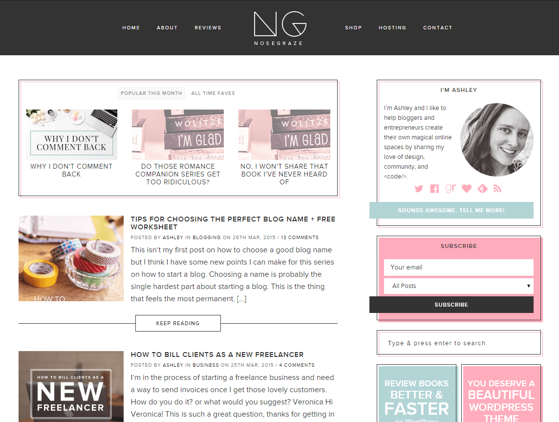
So yesterday I accidentally launched my new blog design.
The design itself was basically done. I kept convincing myself it still needed more tweaking, but honestly, it was done. But since I wasn’t convinced, I wasn’t planning on launching it for a few more days. Maybe Friday.
At around 10pm yesterday, I sat down and started coding my new email template. I had two tabs open: the tab for my new template, and the tab for my old one which I was using as a reference. When it was nearly done, I accidentally pasted my new code in the tab for the old template and saved. In other words, I deleted the template for my previous design. AHHHH!
Suddenly my new template was activated, but my new design wasn’t! Two hours from that point my new post was going to be published and the email was going to be sent out with the new template.
So at this point I had a mini freak out, and then realized I should just launch my new design. Since I didn’t really plan on launching last night (and at 10pm!) it ended up being somewhat stressful, but I got through it!
So, what’s new?
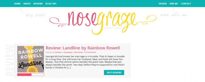
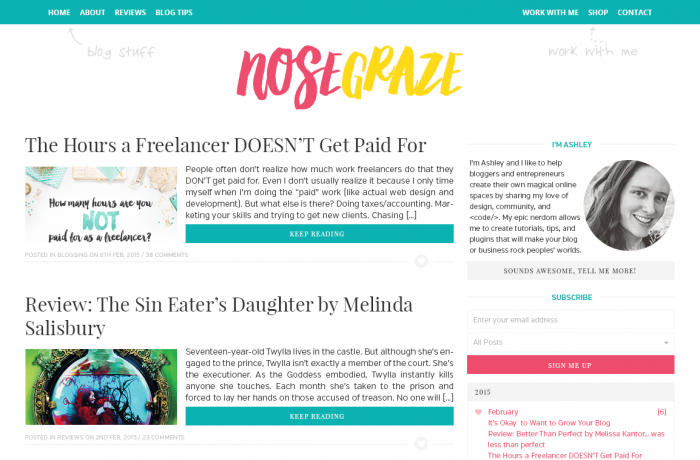
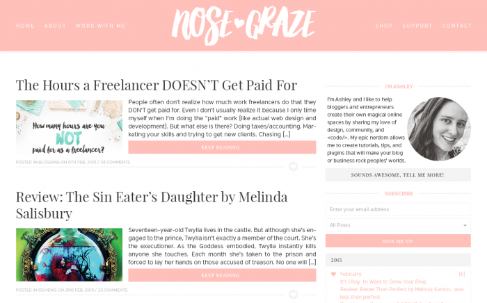
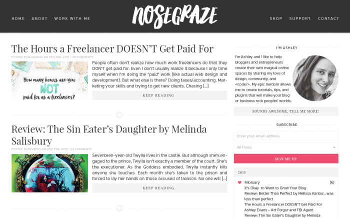
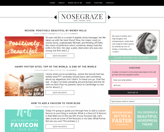
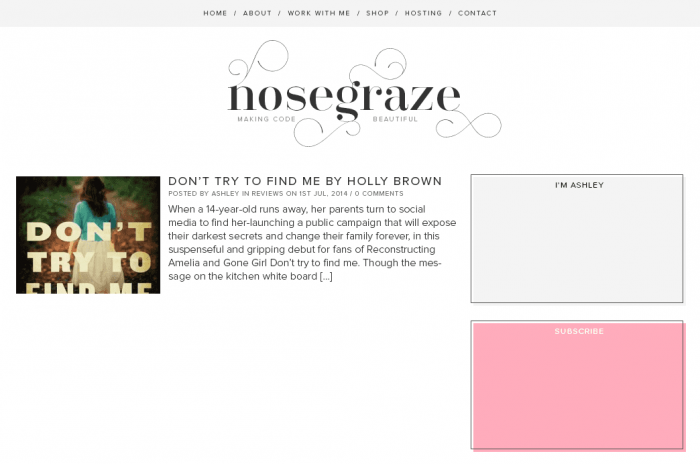
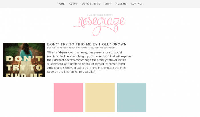
With this Nose Graze redesign, I wanted to go with a totally new style. I wanted to keep it simple and minimal, but not too plain. I went through TONS of different designs over several months. Here are some of my rejects:
The designs that didn’t make the cut:
I started on this one a long time ago, but I got sick of it quickly. But originally I thought it would be cool to have the category name written out on the left like that in big, bold letters.
This was a re-imagining of the previous design. I like it, but it didn’t feel right to me, you know?
Now here’s the design I VERY NEARLY went with. I actually have this completely coded up on my computer. But after looking at it for ~2 weeks, I realized it no longer felt right. It suddenly felt too pink. I still like this design a lot though, just not for me, so I’m thinking of turning it into a pre-made that I’ll offer for sale.
Just to check it out, I tried the same design as before in black and white.
Here’s another design that I VERY NEARLY went with. You can see it’s similar to what I have now but with different colours, a different logo, and just a few other small differences. I grew a little tired of the colours though and decided I didn’t like the logo anymore. But I did also code up this one 100% and I reused most of the same code when I finally settled with my current design.
Here’s just one of my experiments with the font Santis. I fell in love with this font HARD and wanted to incorporate it into my design. As much as I loved it, I found myself getting tired of it after about a week.
…aaaand just some random experiments with logos and colour schemes.
Wow, that was a lot!
As you can see, I went through TONS of different ideas. And I still have loads more that I haven’t shown. I feel like I went through a big identity crisis.
- What did I want my blog to say?
- What direction am I moving in?
- What kind of mood do I want to set?
- Do I want clean lines and a professional look? Or cute and feminine?
- Bright colours or more of a black and white feel, with colour accents?
I finally decided that I wanted a more professional look. I wanted to use a lot of black and white, but still have colours in there somewhere. I ended up with a super simple logo that I’m really excited to put on some business cards!
What’s going on under the hood? Awesome code!
I didn’t just spend a long time creating and coding designs. I also spent a long time completely re-coding my Nose Graze plugin. This plugin is what powers my whole site. It has my own personal version of UBB, the code for my review index, and more.
One of the highlights for me was coding my very own social share buttons
My old ones mostly worked, but had a few problems:
- They didn’t match my design. They stood out (in a bad way) way too much.
- Sometimes they made the page load slowly.
- Some of the buttons (specifically StumbleUpon) broke when I started using SSL.
The main thing I wanted was buttons that matched my design perfectly. So, I coded my own!
Now I cache EVERYTHING
One of my goals for my plugin re-coding was to speed things up. I had some things being cached, like my review archives, but a few things were still slowing down my site. For instance, I noticed that my book review posts took longer to load than other posts. This was because of my related posts section.
My husband helped me code an AWESOME related posts feature about a year or two ago that actually finds related posts based on how many tags they have in common. This makes my related book reviews VERY accurate. If you’re reading a review about a book with political scandals, rebellions, and teenagers, the related posts will show other books that have rebellions or politics. It’s awesome!
But, the related posts have thousands of tags to go through and posts to compare, so it takes an extra second or two to load the page and it’s noticeable. So when I recoded this feature, I made the results cache for a few hours. So they load once, get saved, and then the saved copy gets served for a few hours until it refreshes again. Here’s to faster pages!
And have you see my new about page?
One thing I’ve been wanting to do for a long time is redo my about page. I had so many awesome ideas for this page and I really wanted to put them to action. Well, it’s finally done!
I might still do some tweaking here and there, but overall I’m very happy with what I came up with. I can’t wait to share these tips on my next how to start a blog post.
I’d love it if you’d check out my about page and let me know what you think!
I’m really happy and I hope you are too!
I’m super happy and excited with this new design for my blog. Even though it’s “just” a design change, I feel like I’m on the verge of an awesome new direction for my blog. I still have more changes on the horizon that I can’t wait to share with you all. 🙂 But one thing at a time!


I love it! 😀
Thank you! 🙂
Oh this is nice. 🙂
Glad you think so. 🙂
I love it! It’s simple, and the pops of color are awesome! I also love the logo.
Thanks Katrina! 😀
I love it! I like the pink and yellow ones too though. I think the new NG instead of it spelled out is a cool plan too. You rock!
Thanks so much! I really fell in love with the NG.
Love it! Well, I’ve always loved your design work, so I’m a fan. 🙂
LOVE the About page! Great work!
Thanks Leah! 😀
I really love it, when i first saw it i miss the old one, but now i think it looks fresh, cool, easy and atractive 🙂 and i like it more! altough the fist design that did not made it looks awesome with blue etc 😉
Yeah I had a little minute of mourning for the old one too. It was a very nice, clean design, but this one really takes my blog in a new direction and I’m excited about that. 🙂
It looks great! I love it!
Thank you so much!
Ashley, this design is GORGEOUS! I simply love how everything works seamlessly, and it’s so professional and elegant *O* I’m in LOVE. Whenever I see designs like yours I feel like scrapping my ideas and coming up with something else… haha 😛 I love the minimal and simple style, and also the pop of colour here and there! The color scheme is so tactfully incorporated… LOVE. Now I need to save up so I can get you to help me to code this design I’m working on… xD
GORGEOUS! SO GORGEOUS! MY EYES….
Aww thank you Emily! 😀 I’d definitely love to code whatever you’re working on!
AWESOME! Love the new logo and subtle touches of color. And your About Me page Rocks It Out Girl!
Thanks Bree!! 😀
So much love for the new look! I def like the prof appeal.
Thank you Vi. 🙂 It’s a very new style for me but I’m loving it!
It looks awesome!
I’m glad you think so. 🙂
Looks great!!
Thanks Grace!
I’ve told you already that I LOVE your new design. Now I just checked the new about page. Really awesome! You rock, Ashley! 😀
Thank you so much. 🙂 I’m quite proud of my new about page!
It looks amazing! Love the new about me page. What is the font you used for the logo of your first alternate style? I love that!
The logo of that very first one (with the blue, yellow, pink, and bold category text) is called Bronze Script.
Wow! Just WOW! It looks awesome, all of the little details really make it you, I love it.
Thank you Carrie! 🙂
I love it, Ashley! You’ve done a fantastic job. I adored your old one – it was so cute and feminine, but now it’s like BOOM amazing. I love the pink and blue pops of colour, it really stands out beautifully. Good job, Ashley, it’s gorgeous and I love the link rollovers.
Yeah I loved my old one too, but this one feels like a new me. 🙂 I feel like I’m moving in a different direction from the “cute” look and I love where this is headed!
This looks gorgeous, Ashley! It’s so modern and refreshing! I adore the button effects and the new About page!!! <33333
Thank you Hazel! 😀 I’m a big fan of the button effects too!
It’s so freaking gorgeous. I’m about THISCLOSE to asking for a full redesign from you. You never fail to impress 😀
Haha thank you so much Rosie! 😀
Ashley! I love it!! I love the NG logo and I love the sidebar and ALL OF THE THINGS REALLY. <3
Thanks a lot Jess. 🙂
I love it Ashley! It’s simple, uncluttered and clean looking. I love the pink and blue combination (as you can tell by my blog!) Both the “Reviews” page and the “About” page are unique. Congrats 🙂
Thank you very much! 😀 Now we’re like pink and blue soul sisters, hah!
I love it, Ashley! It’s so pretty. I could stay on your site forever. I love the colors and just everything about this site. I hope you do decide to offer the pink design as a pre-made because I would totally buy it and it’s kind of the same color that my current site is.
Thanks so much!
I will have to make some changes to the pink one since it still has some “Nose Graze code” in it, but once I clean it up, change it, and maybe code in some settings I’ll put that up for sale. 🙂
I absolutely love your new design! It’s very simple and yet feels very professional and elegant 🙂
Thanks so much Iris. 🙂
I love the new design! I wish I was so talented… It seems so crisp and clean, so professional – I love the blog and have developed another bout of blog design envy.
Thank you Harvey. 🙂 I’m so glad you like it!
Ashley, your new design is GORGEOUS. I love it sooo much. It’s so nice and modern and the colours are amazing. Seriously, you outdo yourself time and time again! I love it!
Thank you Annie! That means a lot! ♥
Oh my gosh, this looks fantastic! I love the mostly black and white blog with the colored accents. It just feels so professional and modern, but personal. Your business cards are going to look so great with your new logo. I can’t wait to see the related posts code in action.
Thanks Amber. 🙂 I can’t wait to start designing my business cards!
The new design is looking fabulous. Nice and clean and sooo pretty! I just love seeing all the different drafts of the design and the progression of it to this one.
This just makes me want a new blog design. ;))))
Thanks Cee. 🙂 🙂
Your new design is amazing, Ashley! I don’t even know how you coded the whole thing from scratch, but I really admire you for being able to do that. Hopefully I’ll be able to get to this coding level one day. 🙂 Great job!
Thanks so much Ana!
I can’t believe I coded three whole designs, just to “throw away” two of them haha!
Clean, simple, and pretty.
Thank you. 🙂
I love how sleek this is. Beautiful. And that Santis font is awesome too.
Thanks Anne! I REALLY fell hard for that Santis font. I got to a point where I no longer wanted to use it as my logo, but I still think it’s pretty darn gorgeous.
Wow, it’s so edgy! I really like it. I’m a big fan of logos using letters and most of the really recognizable logos in this world are just fonts. I had wanted to do that with my blog, but decided “BS” would look…well, not quite right LOL.
You’re absolutely right, Jennifer. Most of the ‘big’ logos out there are just simple, clean typography.
And LOL, BS would be strange. I feel like you’d have to take that to a whole other level and have a blog called something like “No BS Book Reviews” or something haha.
Haha, funny you mention it….I’m IRL friends with the girl who runs a blog called exactly that.
Haha, that is funny. 😀
Wow! I love your new design! But I love everything you do! The new logo is going to look great on a business card!
Thanks Kathy! 😀 I’m really looking forward to designing my business cards!
When i got my blog designed for me, I fell HARD for the design. I didn’t really want any major changes at all. I never really thought about how much work and thought goes into creating a blog design as I had one done for me. Now I wonder if my designer went through the same process by sketching up multiple ideas.
What an insightful post!
It’s definitely possible. 🙂 I often go through multiple drafts with my clients and I don’t always show them the drafts I’ve gone through (if I think they should be rejected straight away). It’s really hard to come up with a look that feels right. Usually it takes 2-6 drafts just to get to that point.
Such a lovely design Ashley! It has a feminine, sophisticated and professional look! I loved seeing the other designs you were considering too. So many awesome looks there as well! 🙂
Thanks Charlene. 🙂 I’m looking forward to converting some of my other drafts into pre-made designs for sale in my store. Even though they didn’t feel right for me they might be “the one” for someone else, you know?
The new design looks amazing, Ashley! It’s the bomb. I also really like your About Me design, and the Neopets story hahaha. Man, that takes me back…
Thanks so much!
Neopets.. the good ol’ days.
Great Design Ashley. I really like your logo. Your About page looks terrific too!
Thank you Pat! 🙂
I love it Ashley. It’s clean, modern and elegant. I really like the acent colors too.
Thanks so much. 🙂
LOVE! It has this retro feel that I love! And that font Santis is on point, so gorgeous!
Thanks Giselle!! 🙂
I really fell in love with that Santis font and it aaaalmost became my logo. I eventually moved away from it but I still think the font is pretty freakin’ awesome.
I really like it! I’ve been messing around with redesigns and talking about doing it for two sites for the past six months. It just needs to be done. The problem is it takes time. I’ll get there eventually. Yours looks really good!
Thank you, Tressa!
And you’re right, it totally takes time. It took me MONTHS to design, code, and then actually settle on something. It’s hard work!
All those other designs look fantastic. I really like the black/white version from the design you nearly used. The new logo is great and I love the look from your comment section! 🙂
Thanks Mel 😀 When I release the design I nearly used as a pre-made, I’ll definitely include that black and white option too!
I know I’m late to the party – but I love your new design. I love the colors and I really like how clean and simple it is without being boring!
Woot, great Ashley!
Thanks so much Danny. 😀 I hope you’re doing well!
Wheee, I love it! It’s so sleek and minimal but not, like you said, busy. I’m loving the font Santis but I can see how it can get tiring soon. I guess it’d look better as a feature banner…
I really liked all the black and white designs, too!
Yeah Santis is pretty awesome. I still have it on a few of my blog post images. 🙂
I love the new look, Ashley! Great job!
Thank you! 😀
ASHLEY, YOU HAVE OFFICIALLY BECOME MY CODING AND DESIGNING GODDESS. The new design is PERFECT — I love it so much! Especially what you did with the buttons when you hover over them. Such a cool and original effect! I loved your previous designs, but I think this one has to be my favorite. And YES, Santis is a beautiful font! Been really digging all these simple serif fonts as of late. 😀
Great job, hon!
Daaaaaw, thanks Megan!! 😀 I’m so glad you love it!
Ashley, I love this new look.
We need to talk soon about some pluggin upgrades to my blog, as well as speeding things up.
Feel free to get in touch with me when you’re ready. 🙂
OOOO I love it! It looks so chic and classy. The logo reminds me if an expensive perfume…coming soon to a store near you, Nose Graze.
Ahahah! I love that idea Shawna! 😀 And the name Nose Graze totally works with a perfume… perfume.. scents.. noses.. *giggle*
Holy crap your new look is stunning! IT IS LITERALLY THE DEFINITION OF PERFECTION. I actually quite like your black and white design that you nearly chose, too!
Thank you Melanie!! 😀 I’m so glad you like it!!
Looks great! I like the new logo. I’m having a devil of a time figuring out my own branding. I really need to just hire someone, but that requires money. #sigh Someday. In the meantime, I’m trying to get the fonts in my graphics to match the fonts on the page, and it’s going soooooo well. 😛